Sotheby's
ROLE: Product Director, UX/UI Designer, Lead Engineer
CATEGORIES: Design, Development, Strategy, App
OVERVIEW
My team and I enabled Sotheby’s to create an easy to browse app that was able to be localized for China, Europe, and the US featuring digital catalogues and up to date information on past, current, and upcoming auctions with details of every item up for bidding.
THE BRIEF
Sotheby's wanted to upgrade and re-design their current catalog app to make it feel more in line with the Sotheby's branding. They also wanted to create new ways for Sotheby's customers to find and browse auctions, items, and catalogs.
PROJECT GOALS
- Update the look at feel of the app to fall in line with the new branding guidelines from the Sotheby's design team.
- Allow for the app and design to be easily update in the future.
- Upgrade the entitlement and authentication systems of the app.
- Allow for dynamic filtering and sorting throughout the app.
- The app needs to be localized in multiple languages.
- Immediate goal for an MVP with a series of sprints to add updated features in the app.
RESEARCH
We did extensive research to determine every possible user journey. We set up user testing of the original app to determine pain points and ways they were using the app. We interviewed the Sotheby's team to determine their needs and wants in the new app.
The major challenge was how does a customer find catalogs when Sotheby's produce over 400 a year. We looked at ways for customers to preview and locate items before having to download a full catalog.
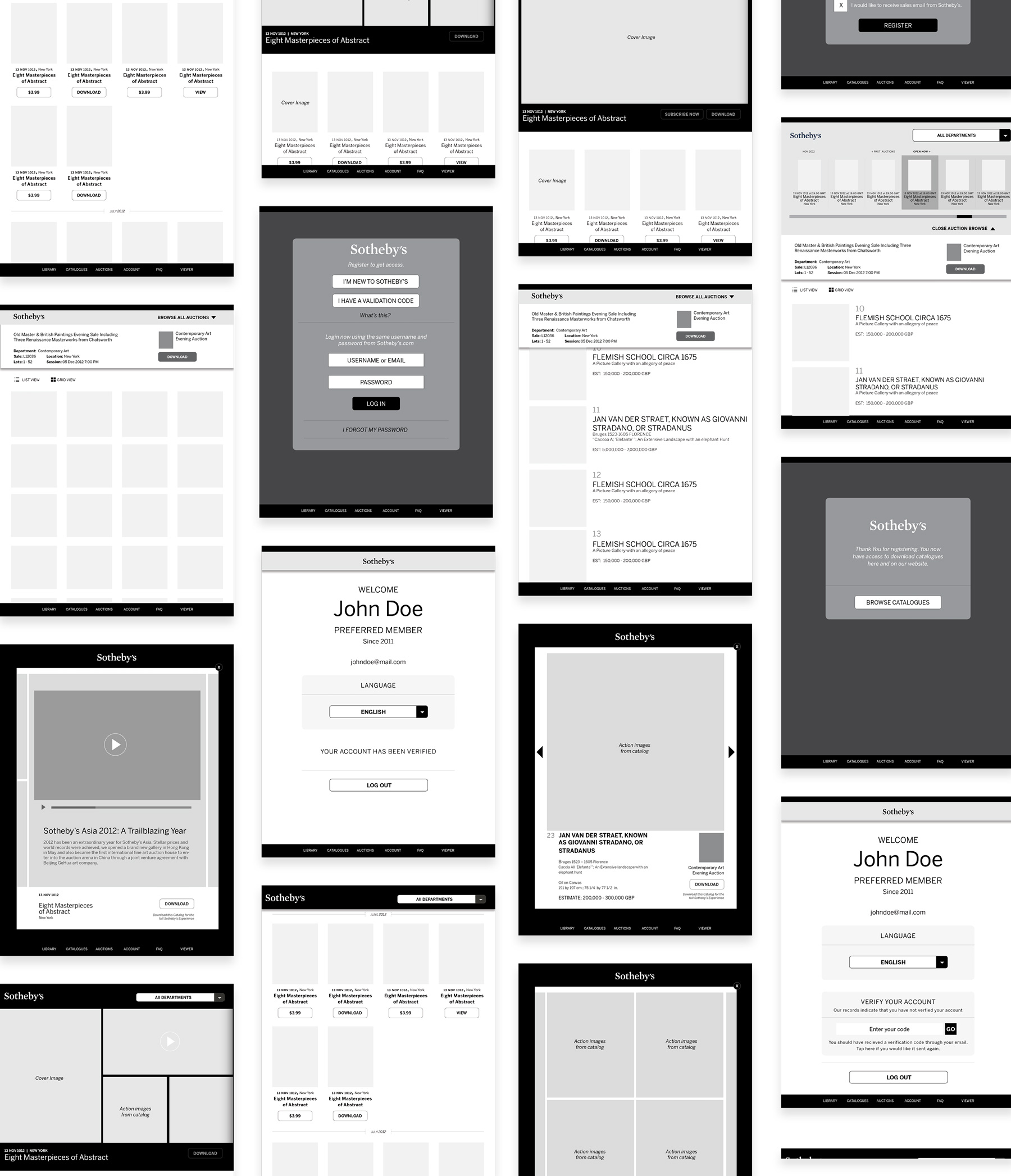
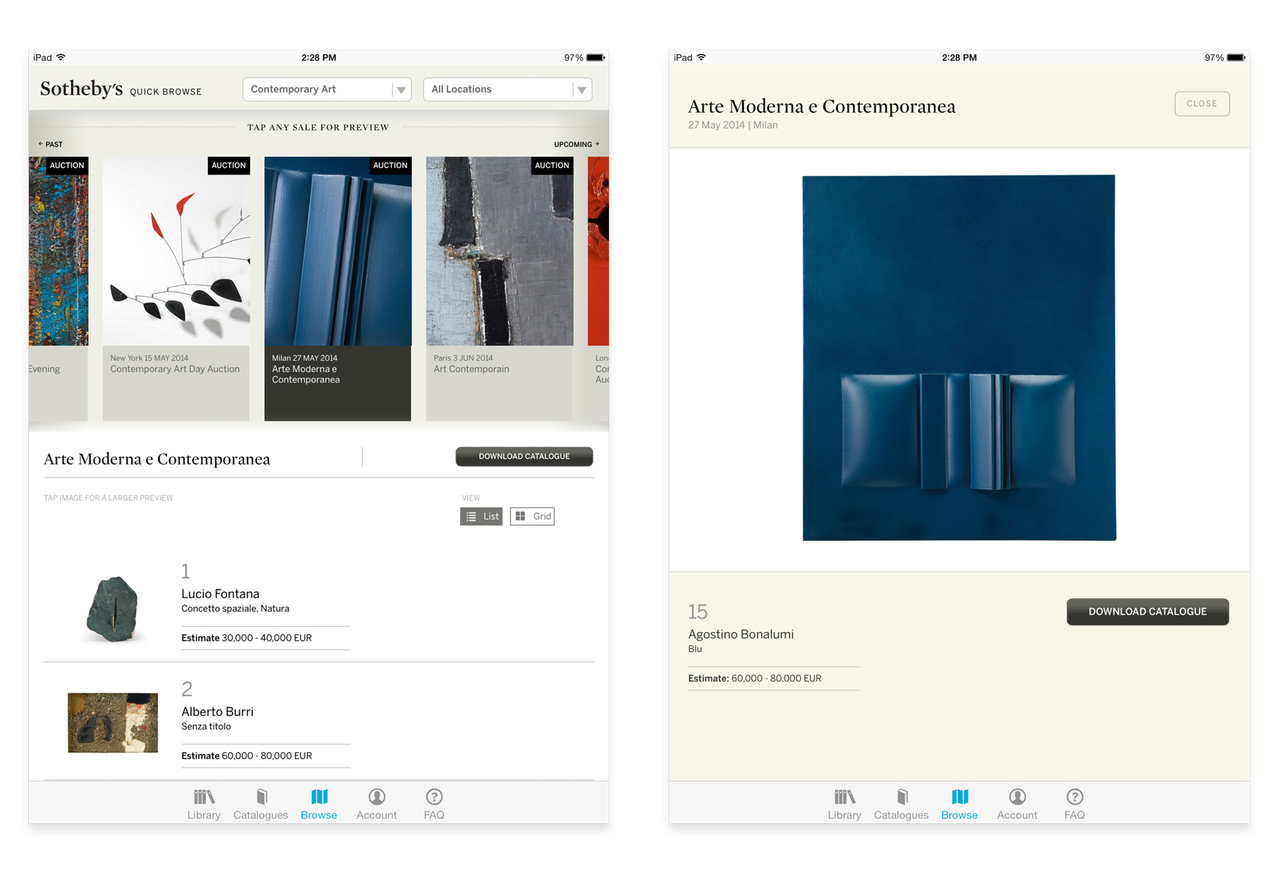
FIND WHAT YOU WANT FAST
We created a fast and easy way to navigate the app by allowing customers to browse catalogs by department or location. We also included a quick look feature that allowed customers to search for items at auction without having to download the full catalog.
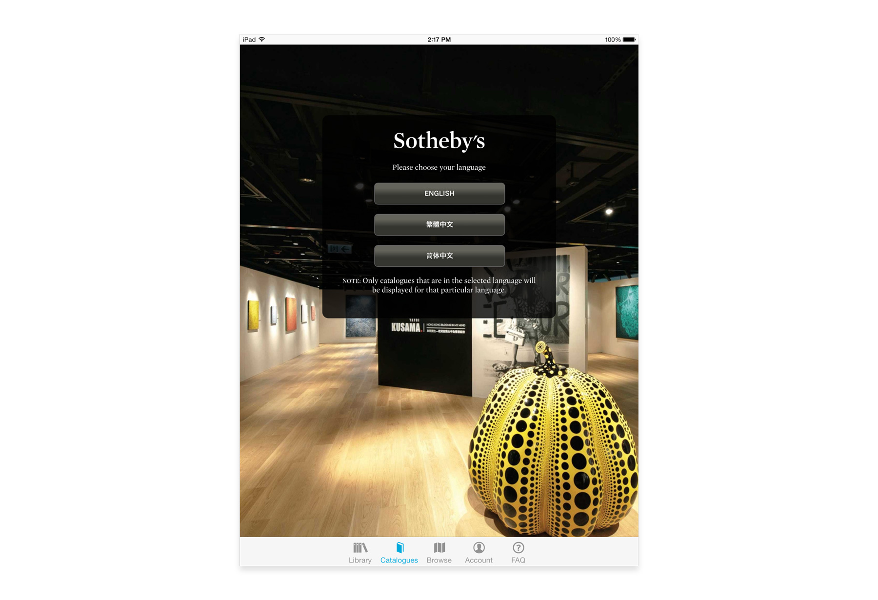
LOCALIZED IN ENGLISH AND CHINESE
When developing the app, we made sure all text and callouts were separated so we could localize the app. The business unit wanted to reach Chinese markets so we were easily able to allow customers to choose English or simplified and traditional Chinese.
FROM SIGN IN
TO SIGN OUT
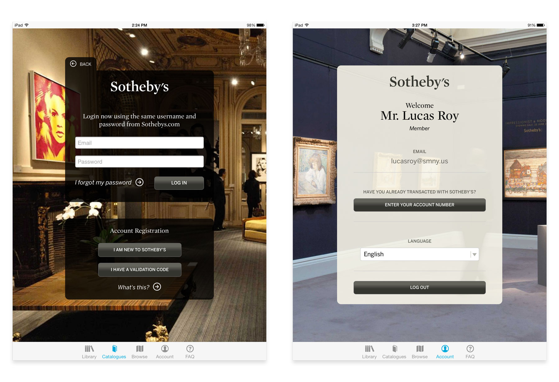
We made sure every part of the registration / login process was easy to use and simple to follow. There were multiple user entry points into the app so we had to account for multiple user journeys during the registration process.
FROM SIGN IN
TO SIGN OUT
We made sure every part of the registration / login process was easy to use and simple to follow. There were multiple user entry points into the app so we had to account for multiple user journeys during the registration process.
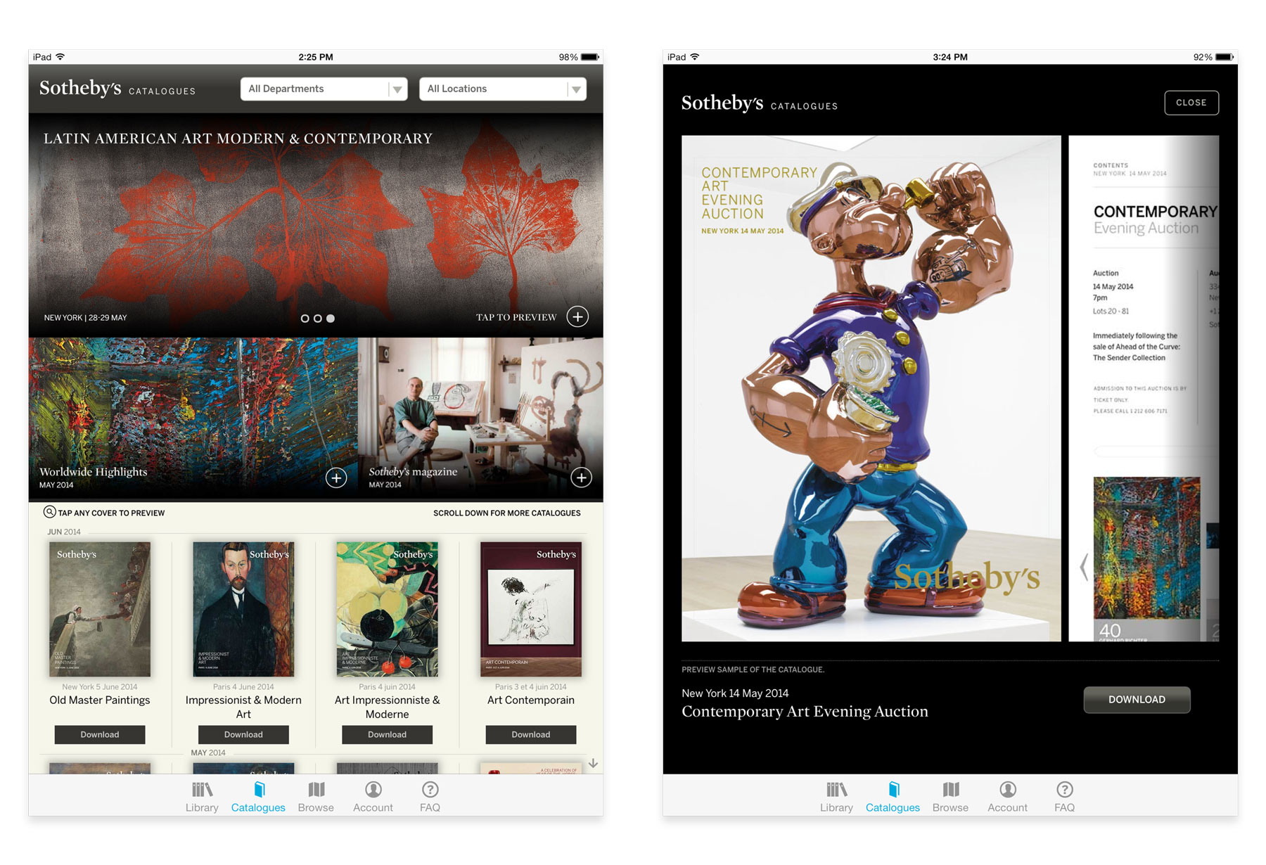
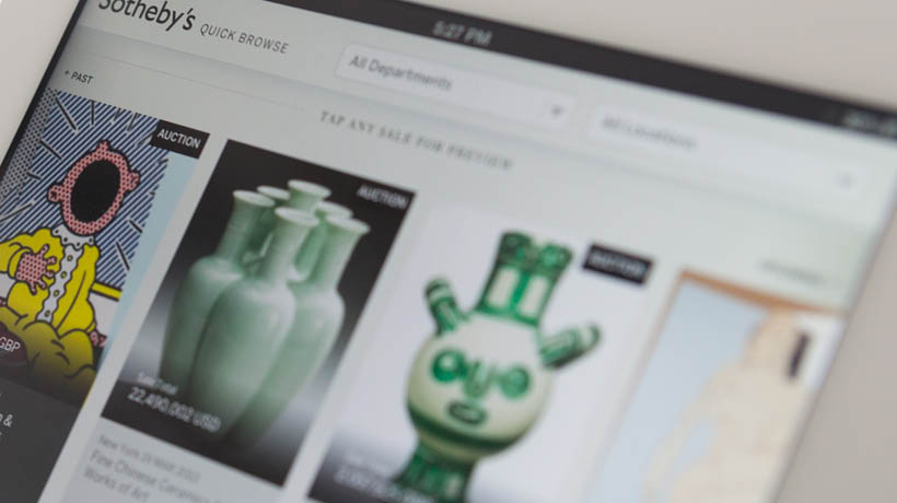
AN EASIER WAY TO FIND CATALOGS
Sotheby's has an extremely thorough library of digital auction catalogs. We created ways for customers to filter these catalogs by department, location, or date. We created a prominent area for Sotheby's to automatically feature up-coming catalogs.
A NEW WAY TO BROWSE AUCTIONS
We wanted to create multiple entry-points to find auctions / items. This led to the creation of a browse mode. There was a timeline at the top that featured past, current, and future auctions. This allowed customers to see every item within the auction without having to download the whole catalog.
THE RESULTS
The Sotheby's catalogue app helped reduce print costs and moved more than 50% of the customer base toward digital. This also increased brand awareness and sales registration. Overall the app was met with positive feedback by customers who were able to find auctions and items faster than they could through previous iterations.
Case Studies
West ElmProject type
Gather JournalProject type
Martha StewartProject type
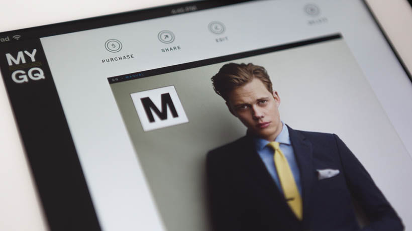
MyGQProject type

Garden & GunProject type
Sotheby'sProject type
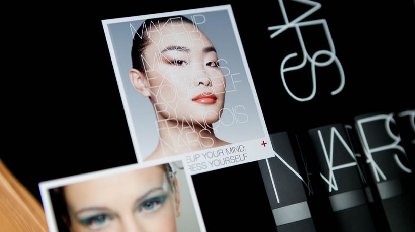
NARS CosmeticsProject type
Selected WorkProject type
ABOUT ME
I’m Nate Mueller – designer, builder, and former partner at Studio Mercury.
At Studio Mercury, I produced comprehensive award winning brand identities, campaigns, and digital products that spanned multiple industries and platforms. As co-founder and director of digital at Studio Mercury, I oversaw the creation of digital identities, translation of brands throughout their digital projects, and manages all aspects of projects from start to finish between multiple stakeholders, designers, and development teams. I wrote, pitched, and presented proposals that allowed our studio to compete and win projects with $500k budges. I led both creative and development teams of between 5-15 people, all while working on multiple projects (usually between 8-12 concurrently). I’m a passionate leader with success in building, mobilizing, and developing cross-functional teams of strategists, designers, programmers, directors and photographers.
While pursuing my Masters at the Rhode Island School of Design (RISD), I developed a healthy skepticism of the role of technology in our lives. I believe the integration of technology should be purposeful and well thought out and I apply this ethos to my work.
Sometimes when I’m tired of looking at the screen, I’ll hand-print wallpaper or hack Nintendo cartridges. Working with my hands helps fuel my inner maker.
I currently live in San Francisco.

You can reach me at: [email protected]
LinkedIn or Instagram.
You can reach me at: [email protected] LinkedIn or Instagram.
You can reach me at: [email protected]
LinkedIn or Instagram.