Martha Stewart
OVERVIEW
Martha Stewart assembled a small team to help her research and develop a way of creating digital versions of her magazines. I was a part of this team to help figure out a design system for creating issues every month as well as creating new interactive features for her other titles. The collaboration went so well, my team and I were then tasked to re-imagine a cohesive app experience across all apps and magazines under the Martha Stewart Omnimedia umbrella.
Digital Editions
ROLE: Product Designer, Interaction Designer, Lead Engineer
CATEGORIES: Design, Development, Strategy, Apps
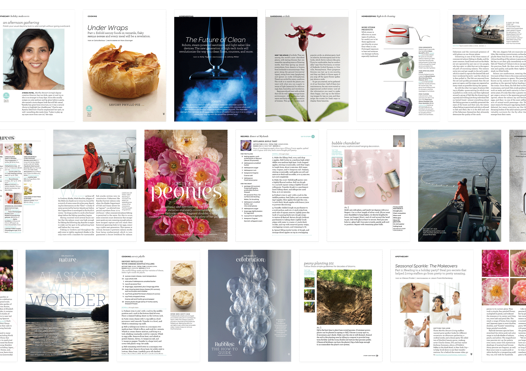
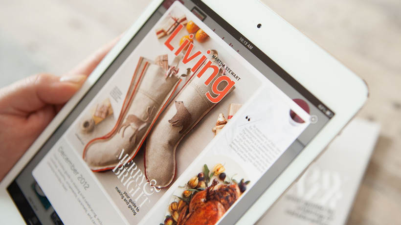
A DESIGN SYSTEM FOR DIGITAL MAGAZINES
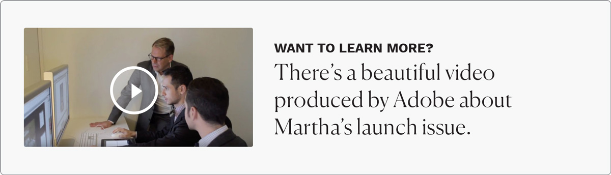
The iPad had just been release and digital magazines were brand new. The problem was, how do you translate the look and feel of a print issue onto the screen so readers feel familiar but also allow for new interactive content never before seen. We created a unified system of templates for the magazine's design team to easily create the magazine every month. It was more structured for the opening / front-of-book sections and allowed for more flexibility for highly-designed featured articles.
A NEW VISUAL LANGUAGE
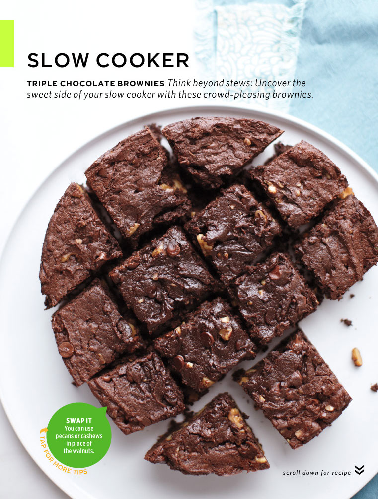
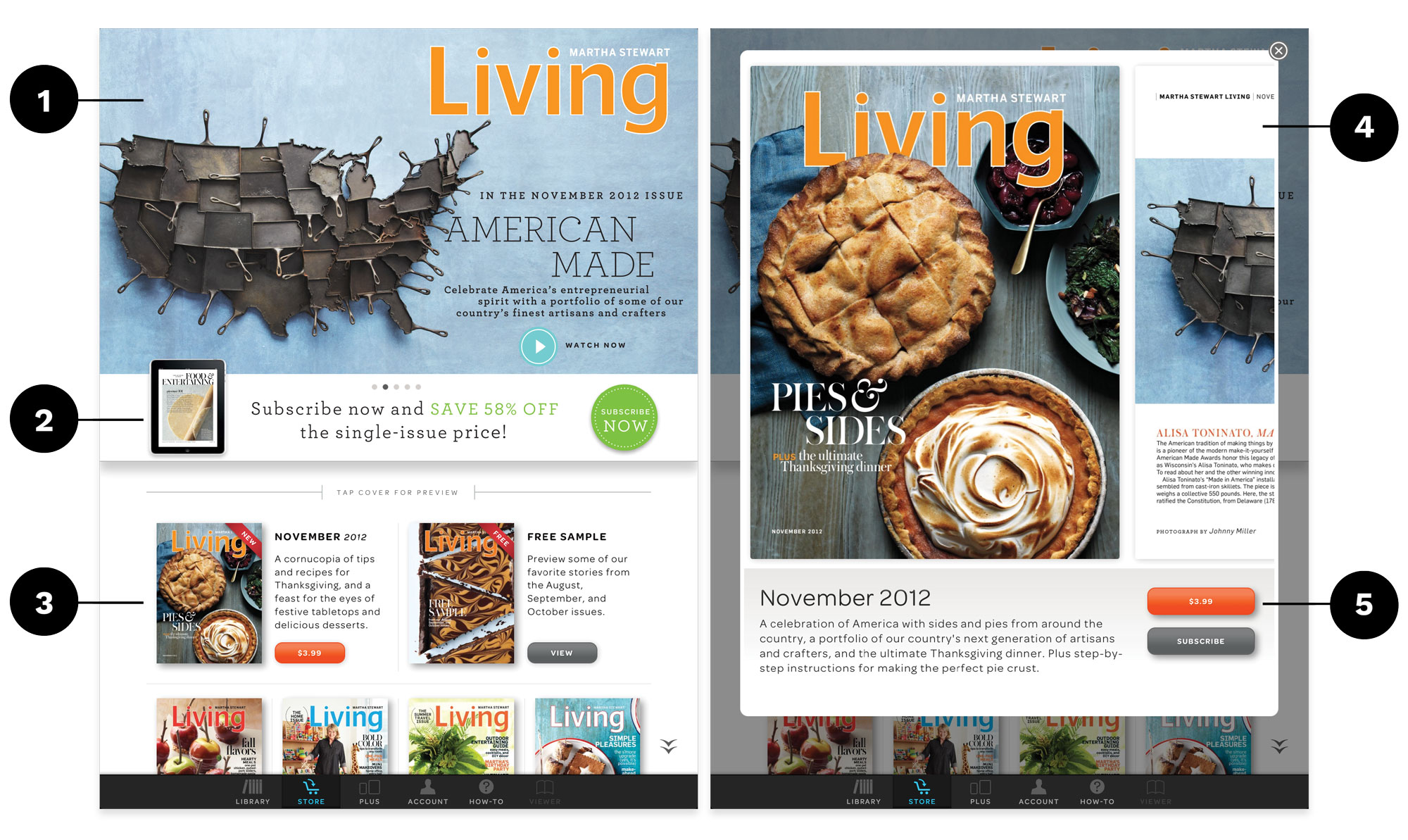
The iPad promised a more "lean-back" experience. People could spend more time on the device to read (just as they did a magazine). This allowed for more discovery of interactive features in a digital magazine. The language and visual vocabulary for interactive features in digital editions had not been created yet so we started new. We went through multiple iterations of buttons, language, components, and templates to figure out the best way to help readers navigate the new digital magazines. We settled with round buttons and used the iconic Martha Stewart blue to designate interactive / tappable experiences.
INTERACTIVE FEATURES
After the launch of Martha Stewart Living, my team helped each of the other titles create opportunities for interaction in their magazines. This helped set each title apart from the other digital magazines entering the landscape.
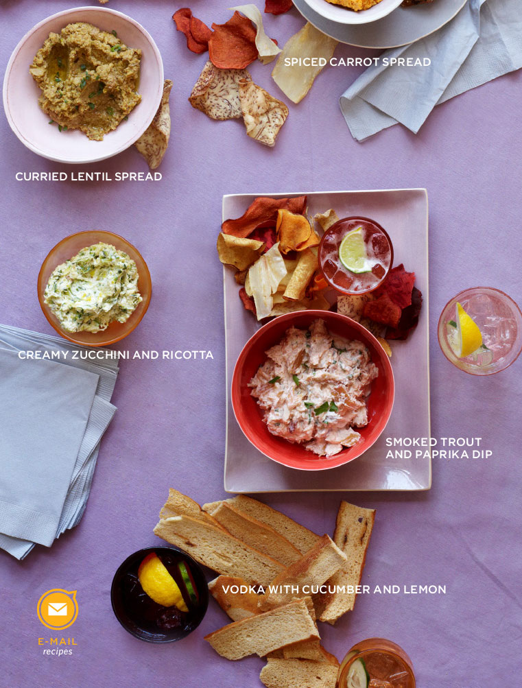
We created a way for readers to email recipes directly from the app so they could create shopping lists from the recipes they loved. We also created fun interactive widgets to show quick tips around the magazine.
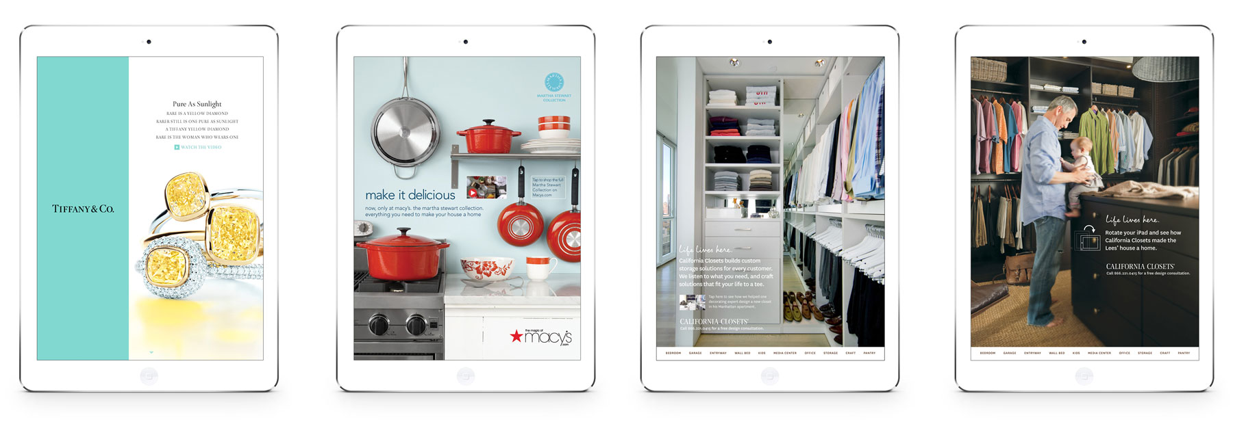
NEW FORMS OF ADVERTISING
Every aspect of digital magazines were brand new. Advertisers had never created an interactive advertisement for a digital magazine. My team and I worked with select advertisers (Tiffany & Co., Macy's, and California Closets) to help them create immersive digital advertisements for Martha Stewart's new digital magazines.
THE RESULTS
After launching Martha Stewart Living's first digital edition, it was number 1 on the Apple App Store within the lifestyle category. Martha Stewart teamed up with Nielsen to study the impact of advertising on the new digital magazines. They found that every advertiser experienced an increase in brand awareness with several advertisers seeing percentage jumps 3-4×. And to top it off, Time Magazine featured Boundless Beauty (the first issue of Martha Stewart Living) as one of the top 10 of 2010.
App Re-imagined
ROLES: Interaction Designer Product Designer, Lead Engineer
CATEGORIES: Design, Development, Strategy, Websites, Apps
SIMPLIFYING THE APP EXPERIENCE
The launch of the digital edition of Martha Stewart Living was so successful, my team was invited back to help all of her iconic magazines re-imagine their whole app experience. These titles included: Martha Stewart Living, Everyday Food, Whole Living, and Martha Stewart Weddings.
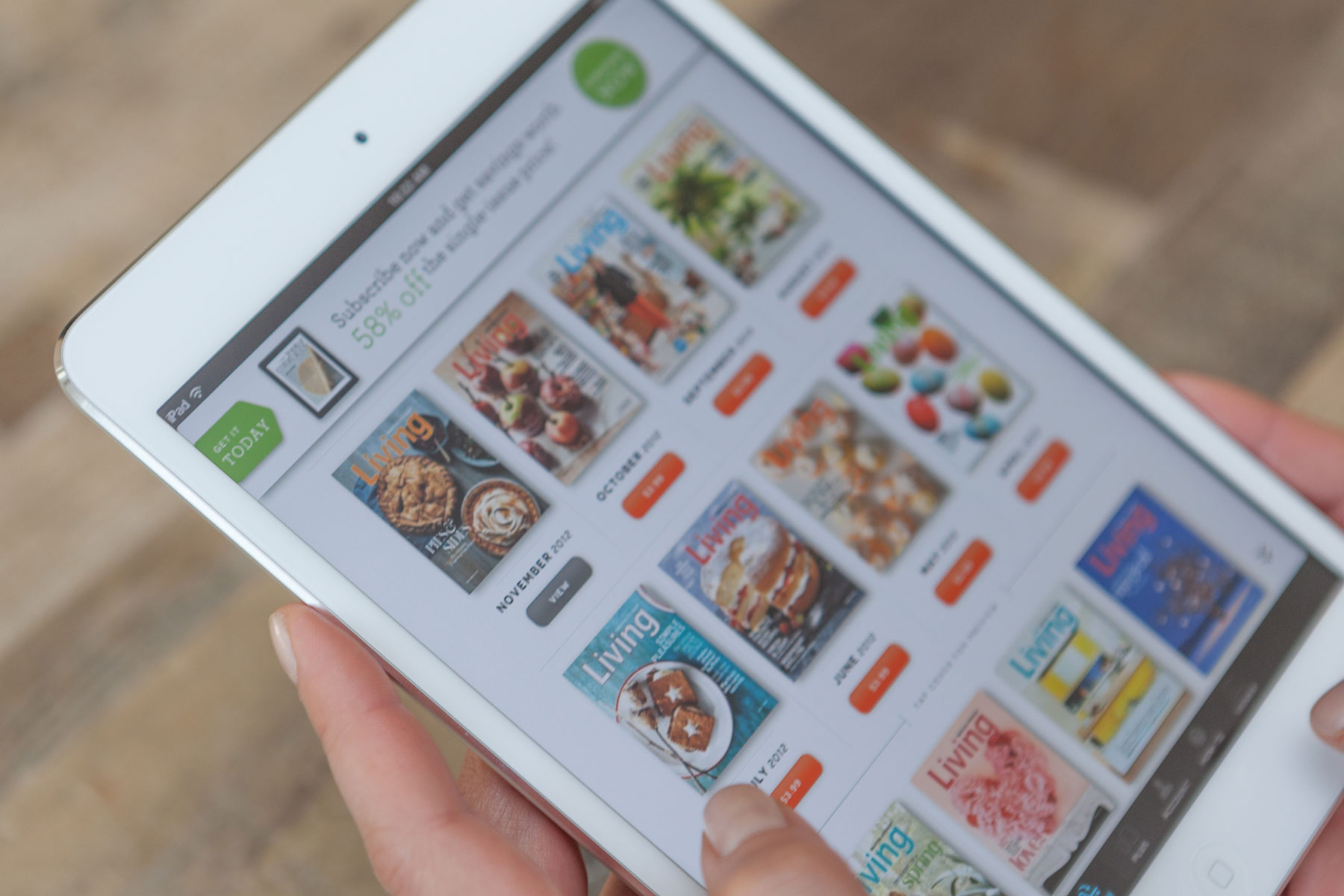
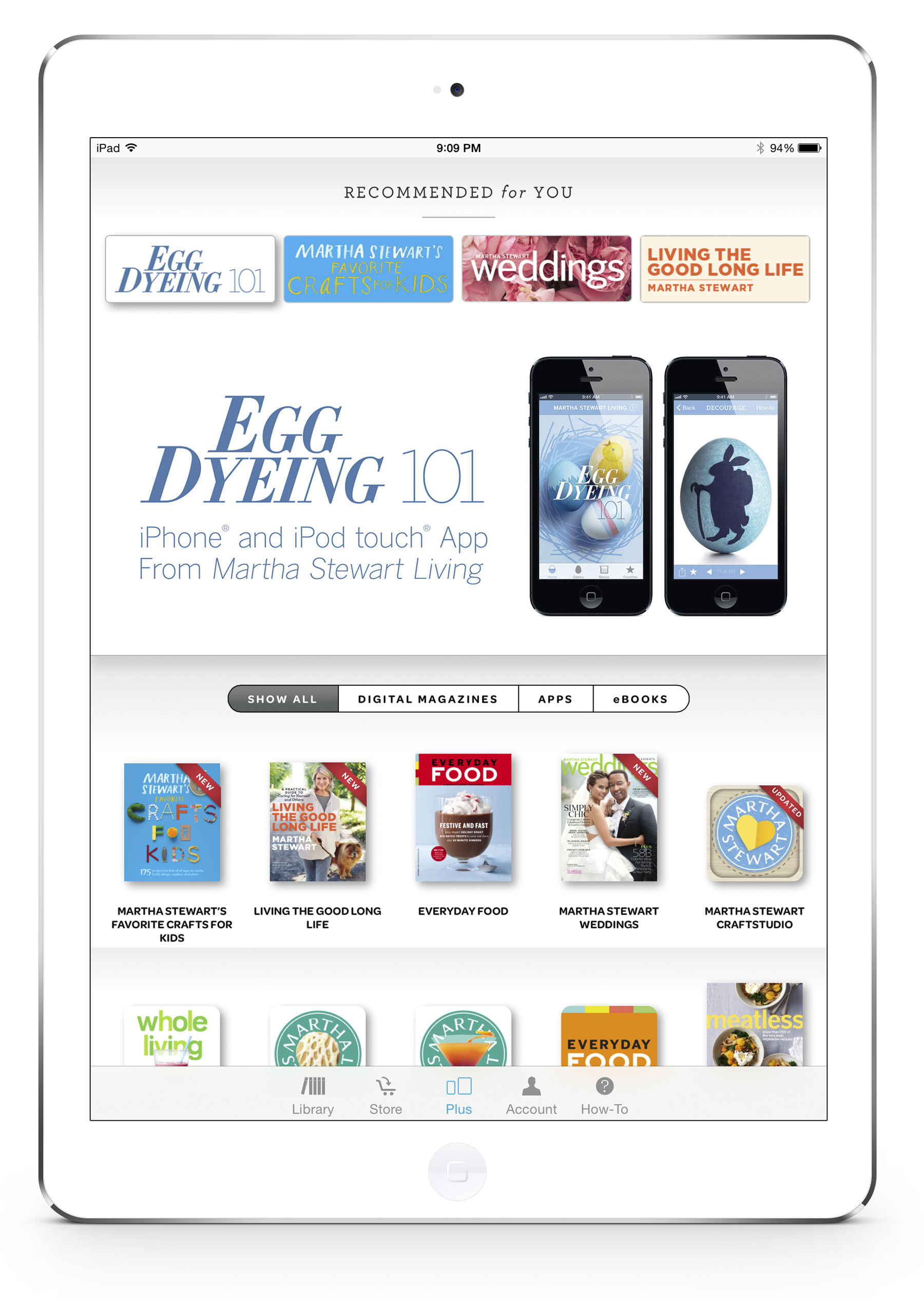
We developed a whole new way for readers to discover issues (both new and old) as well as help them discover content from other Martha Stewart titles.
RESEARCH
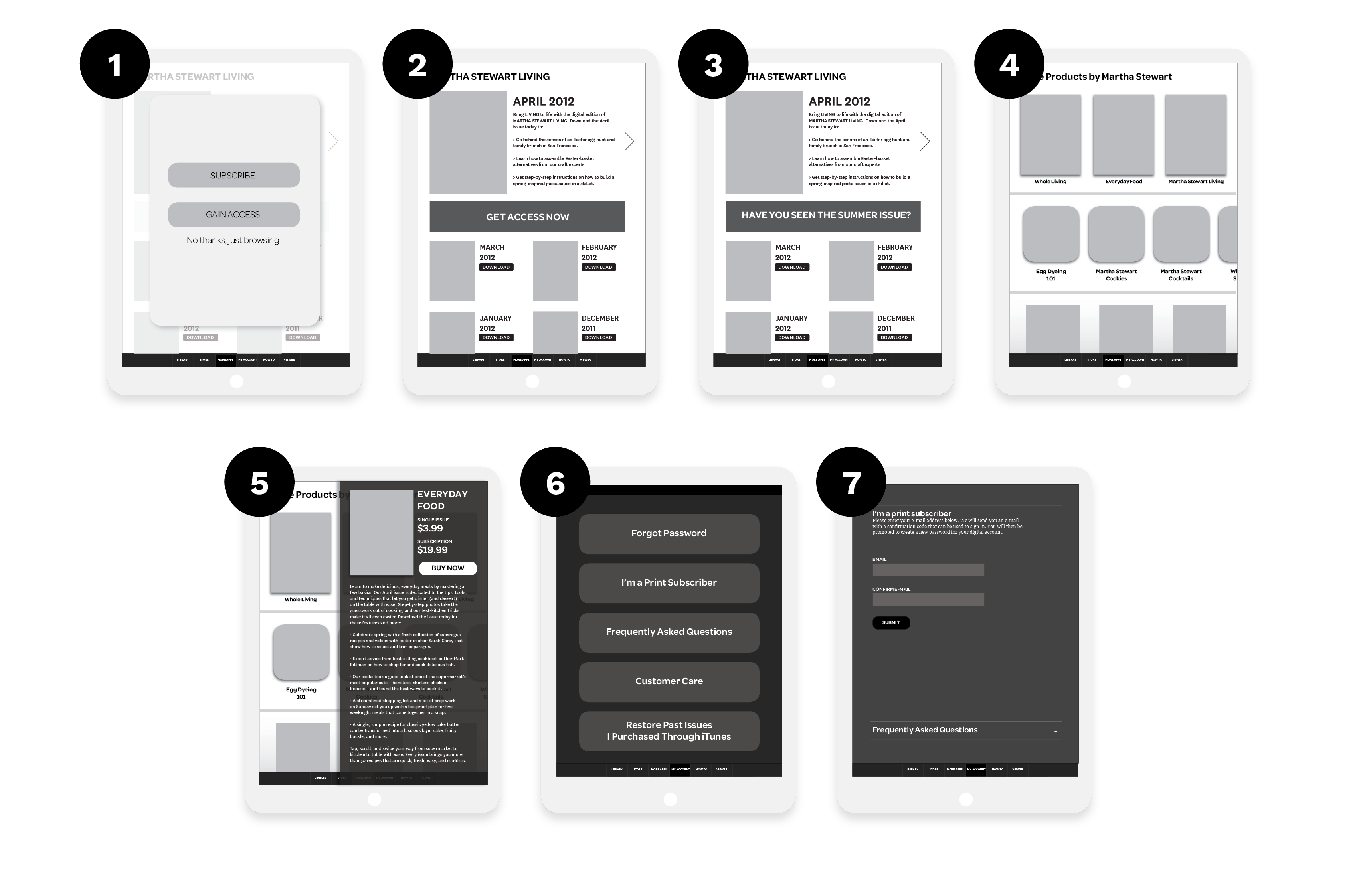
- When launching the app, there were four different user journeys that were possible. We needed to create an easy way to narrow down what kind of user opened the app: someone who wanted to subscribe, someone who already subscribes, someone who is a print subscriber but needs to create an account, or someone who is just browsing.
- The call to action language had to change depending on the user type. This could be an opportunity for the brand to entice a user to subscribe.
- Users who are already subscribers do not need to see subscription messages. Instead, we could highlight features they would want to read in the newest issues.
- We wanted to figure out a way to highlight and cross-promote the whole Martha Stewart digital library of ebooks, apps, and magazines.
- This cross-promotion area needed to display screenshots and key product information like a direct link to purchase / download.
- The app needed an easy way to access account specific actions like resetting a password, restoring past purchases, or accessing the customer support portals.
- If a user was a print subscriber, they were entitled to a digital subscription for free. We wanted to make this process painless so this was also another consideration.
UNIFIED APP DESIGN
Our goal was to make sure there was a consistent user experience between each of the Martha Stewart magazines. From a user perspective this helped a reader feel at home whenever they opened each of the Martha Stewart Magazine apps. There was a consistent way of navigating the app, finding issues, and accessing account information. For the team at Martha Stewart this unified system helped them maintain, update, and create content for all of their apps.
KEY FEATURES
- We create a large opportunity for the brands to promote content from new and old issues. This also included video content that could give readers a preview into the issue. This space could also contain marketing material for readers who were not subscribers.
- A sticky banner and other marketing opportunities were created throughout the app. This allowed the consumer marketing team at each brand to promote special deals, special issues, or highlight content from the newest issue.
- We created a space for "hero" issues. These could be issues an individual magazine wanted to highlight: the newest issue, a free issue, or even seasonal special issues .
- Tapping on an issue displayed detailed photos of the cover and highlighted articles found in the issue. The reader could easily get a sense of what was inside before purchasing.
- Every issue detail featured a east to find call to actions for purchasing the individual issue or purchasing a subscription.
A SPACE TO SHOW OFF
Each brand app featured a section to show off the entire Martha Stewart digital catalog of apps, ebooks, and other digital magazines. Readers could explore other Martha Stewart offerings without having to leave the app. We created opportunities for large callouts for new and relevant content. For example they featured their Egg Dying app during the lead up to Easter. Each magazine could tailor the recommended products based on the demographics of each brand's reader base.
THE RESULTS
The Martha Stewart team was easily able to update and maintain all of the magazine apps every month when new issues were released. The imagery in the app was easily updated every month so whenever a reader opened the app it felt fresh.
This was also the first time a digital magazine cross-promoted their other digital content. Their team saw an increase in sales of digital products because of the increased exposure through the magazine apps.
Additionally, their advertising and marketing teams were able to target subscription deals and featured issues using the app's new marketing banners. This saw an increase in engagement and sales of Martha Stewart subscriptions.
Case Studies
West ElmProject type
Gather JournalProject type
Martha StewartProject type
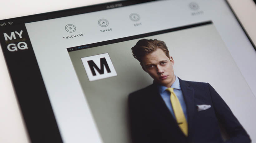
MyGQProject type
Garden & GunProject type
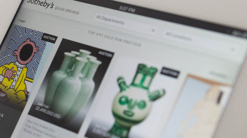
Sotheby'sProject type
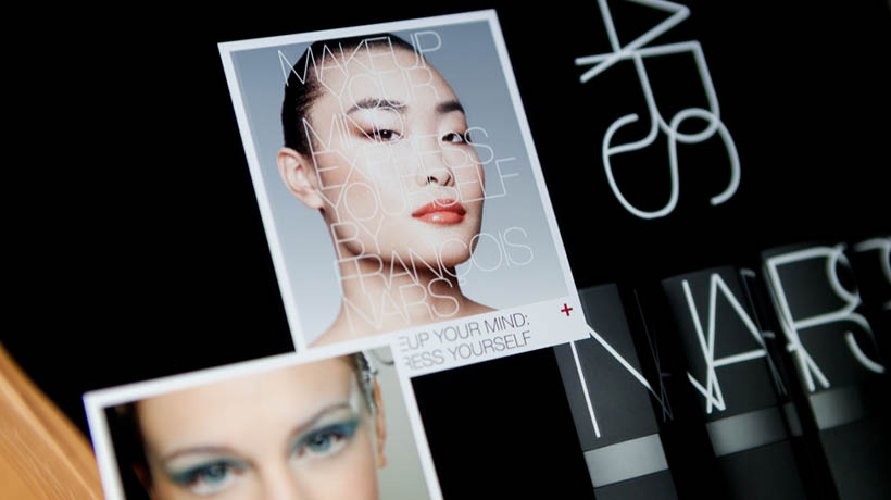
NARS CosmeticsProject type
Selected WorkProject type
ABOUT ME
I’m Nate Mueller – designer, builder, and former partner at Studio Mercury.
At Studio Mercury, I produced comprehensive award winning brand identities, campaigns, and digital products that spanned multiple industries and platforms. As co-founder and director of digital at Studio Mercury, I oversaw the creation of digital identities, translation of brands throughout their digital projects, and manages all aspects of projects from start to finish between multiple stakeholders, designers, and development teams. I wrote, pitched, and presented proposals that allowed our studio to compete and win projects with $500k budges. I led both creative and development teams of between 5-15 people, all while working on multiple projects (usually between 8-12 concurrently). I’m a passionate leader with success in building, mobilizing, and developing cross-functional teams of strategists, designers, programmers, directors and photographers.
While pursuing my Masters at the Rhode Island School of Design (RISD), I developed a healthy skepticism of the role of technology in our lives. I believe the integration of technology should be purposeful and well thought out and I apply this ethos to my work.
Sometimes when I’m tired of looking at the screen, I’ll hand-print wallpaper or hack Nintendo cartridges. Working with my hands helps fuel my inner maker.
I currently live in San Francisco.

You can reach me at: [email protected]
LinkedIn or Instagram.
You can reach me at: [email protected] LinkedIn or Instagram.
You can reach me at: [email protected]
LinkedIn or Instagram.