Garden & Gun
OVERVIEW
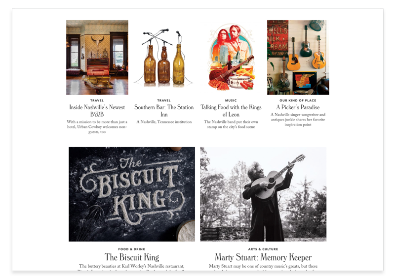
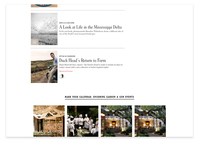
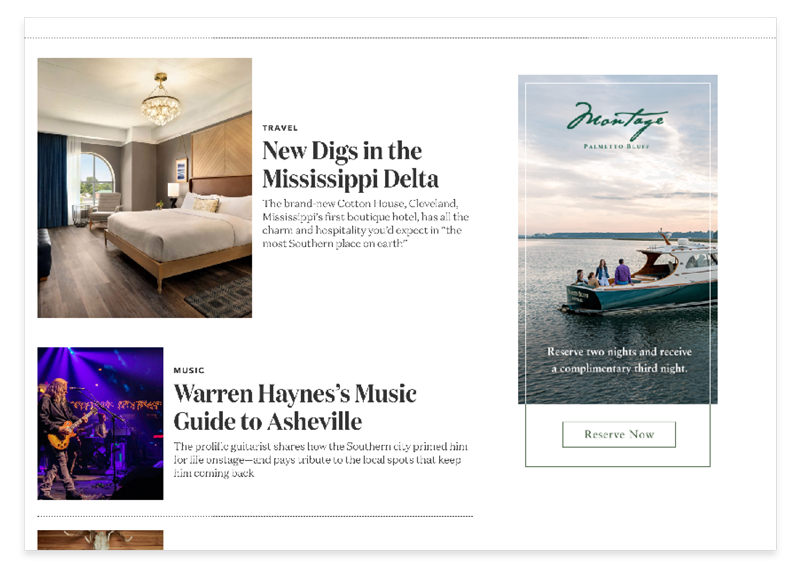
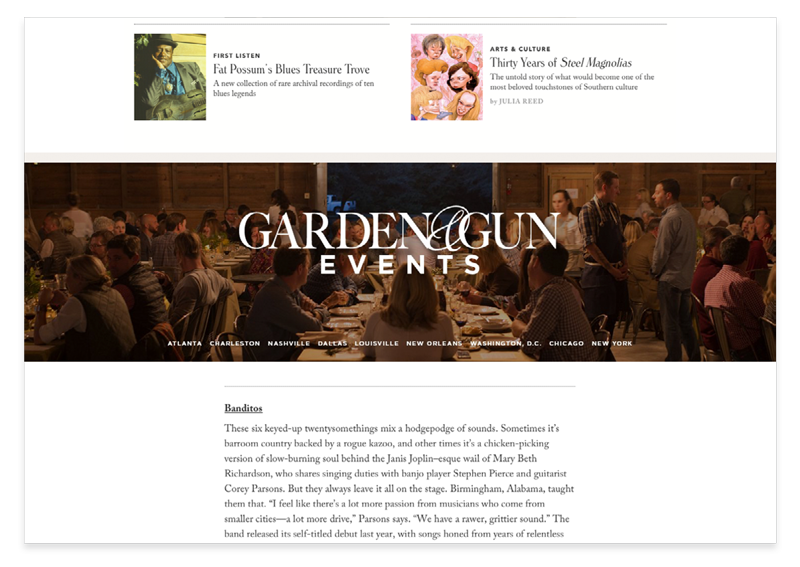
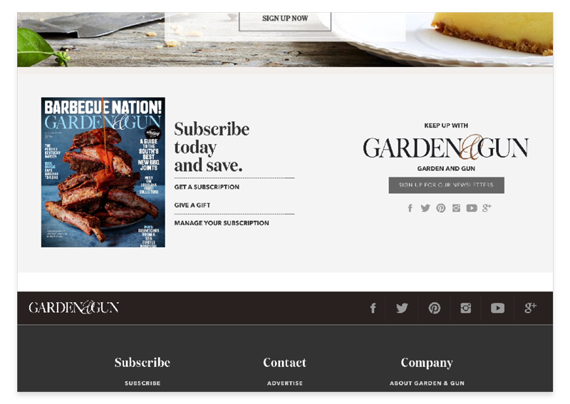
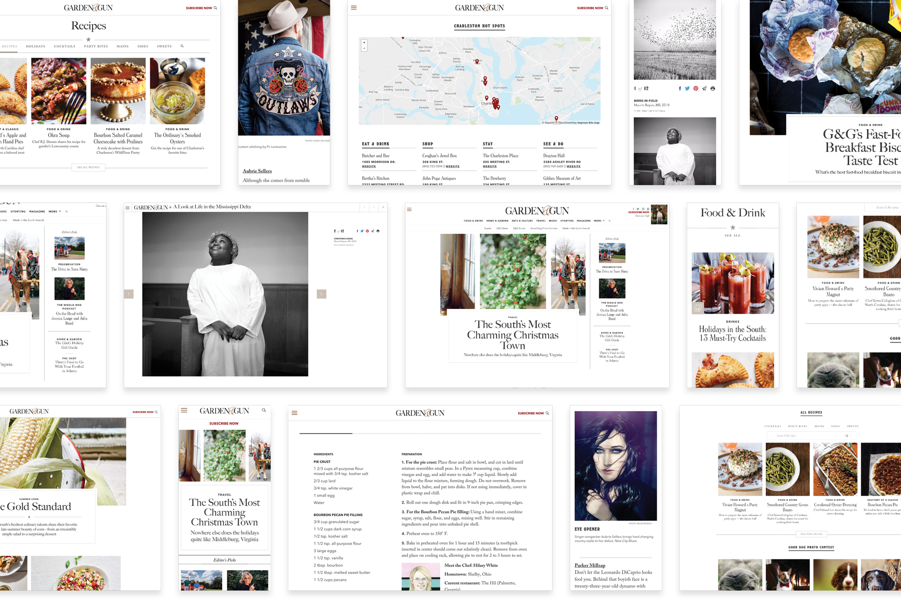
My team was approached by Garden & Gun to help them relaunch their website. With a 6x/year publishing calendar, G&G's new website had to provide solutions to keep things fresh despite limited content. We designed a CMS driven site that empowers editors to create completely custom pages that generate automatically by categories and tags. The system allows evergreen content across issues to mingle in engaging ways with minimal effort. The site design offers the same luxurious long form reading experience as the print publication and adds digital perks like video, audio, and immersive galleries with online only exclusives.
Re-imaging an Iconic Southern Brand
ROLE: Design Director, Product Director, Solution Architect
CATEGORIES: Design, Development, Strategy, Websites
THE BRIEF
Garden & Gun were looking to push their website to the next level. They approached my team to help them create a new digital platform that would allow them to grow.
PROJECT GOALS
- Refresh the design of the Garden & Gun website.
- Migrate all existing content from the previous website.
- Create new opportunities for advertisers and sponsored content.
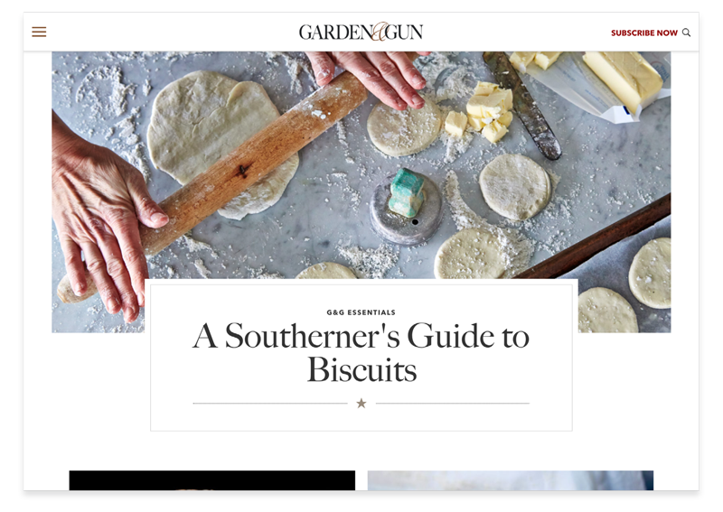
- Allow the Garden & Gun team to easily create engaging long form feature articles.
- Create opportunities to highlight and curate evergreen content around the site.
- Help the editors and the web team keep the content fresh and new throughout the day.
RESEARCH
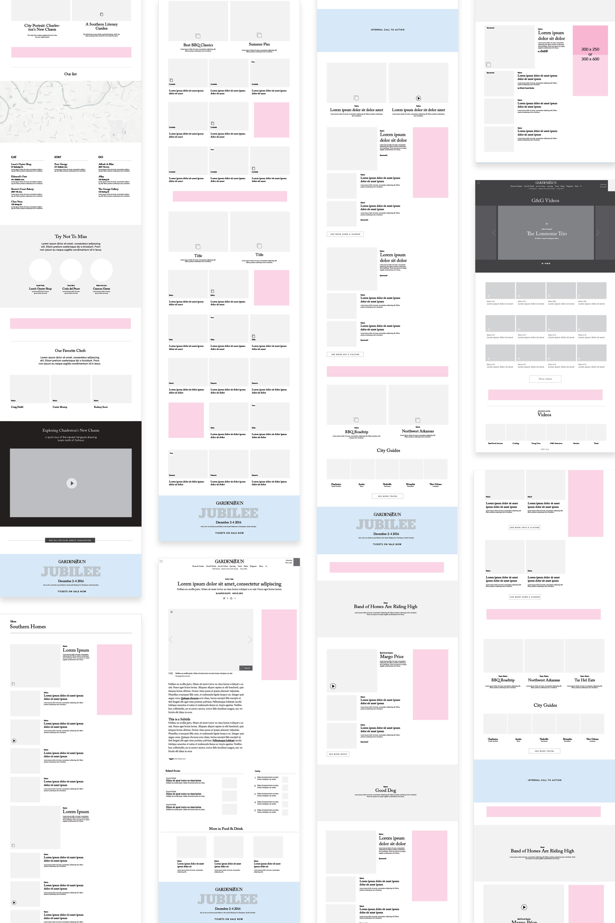
We had an extensive discovery and market research phase. We looked at all of the different content types Garden & Gun produces as well as what their competitors were doing. We interviewed members from all of their different teams: marketing, web, editorial, etc. to track down their pain-points, bottlenecks, and most desired features. The Garden & Gun team wanted a way to easily produce beautiful immersive features, highlight their evergreen content (like recipes), offer more opportunities for advertising, and make their lives easier with automatically curated content and pages around a specific categories, content types, themes, or tags.
AN EMPHASIS ON VERITCALS
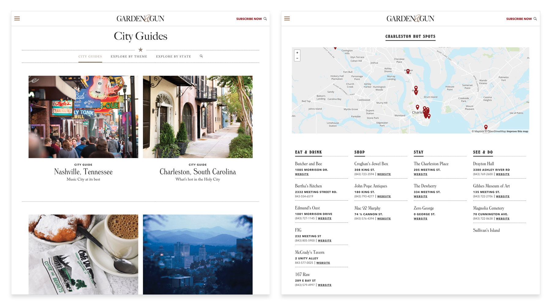
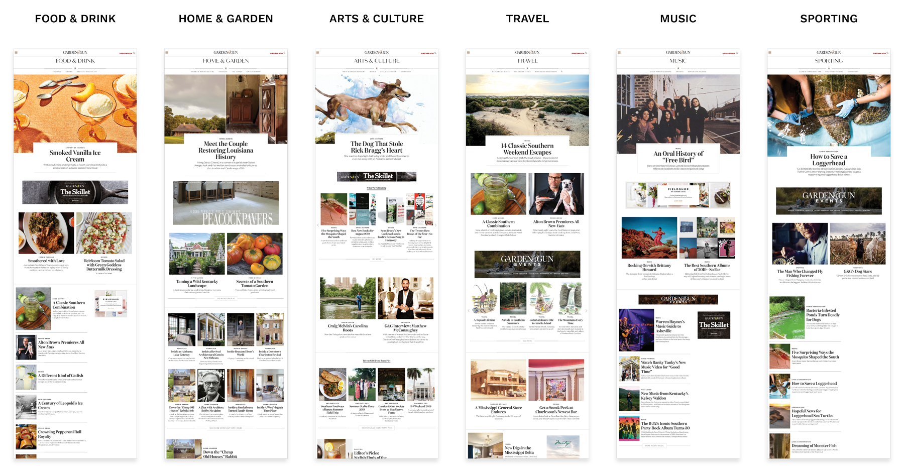
Garden & Gun content is organized into a series of verticals (content types). We decided to improve the experience and display of content on these pages. Each vertical can highlight the most important content for that page. Editors can hand-select content to feature or allow the system to refresh the content for them automatically.
CUSTOMIZABLE & AUTOMATED
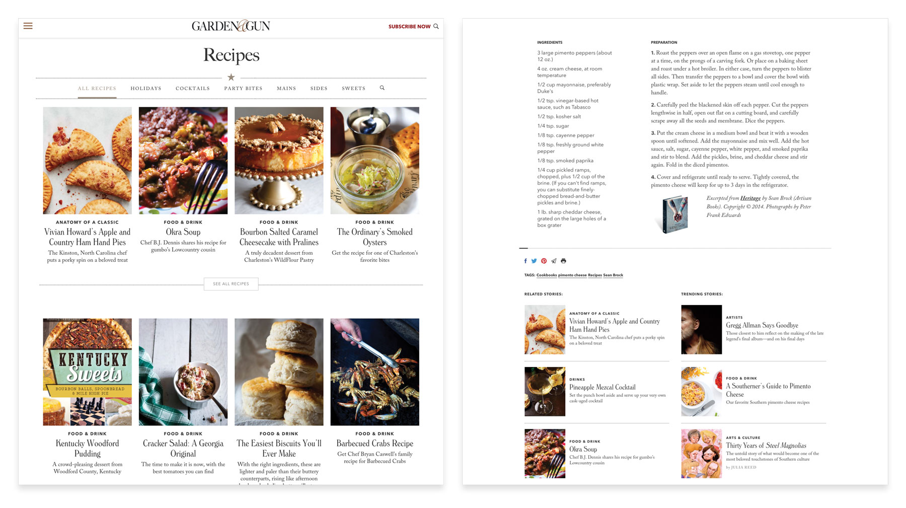
All Garden & Gun pages are built utilizing a system of modules that allow for both customization and automation. Garden & Gun's editors can select a specific piece of content to feature or set a category, tag or content type to keep things refreshing through evergreen content. Site visitors see both highlighted and new stories on every visit.
The modular system can expand the site’s functionality with new modules designed and built for needs as they grow with time.
A SLIDESHOW UPGRADE
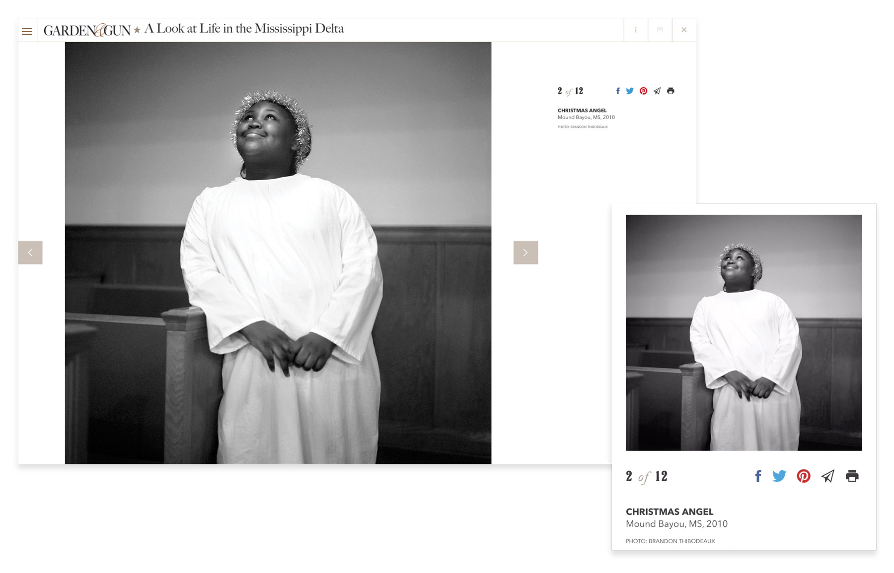
Desktop slideshows were designed for full screen for a completely immersive view. Mobile employed a listview to serve up images via scrolling.
A SLIDESHOW UPGRADE
Desktop slideshows were designed for full screen for a completely immersive view. Mobile employed a listview to serve up images via scrolling.
Key Takeaways
THE RESULTS
It was a big hit on launch. Garden & Gun readers loved the new site and people took notice of the new design. After the launch, Garden & Gun won countless Society of Publication Design medals including Gold Medal for Brand of the Year in 2017.
Advertisers were excited too. With new avenues for sponsored content and advetisting channels, Garden & Gun saw an increase in reader viewership and engagement as well as an increase in advertising revenue.
Case Studies
West ElmProject type
Gather JournalProject type
Martha StewartProject type

MyGQProject type
Garden & GunProject type
Sotheby'sProject type

NARS CosmeticsProject type
Selected WorkProject type
ABOUT ME
I’m Nate Mueller – designer, builder, and former partner at Studio Mercury.
At Studio Mercury, I produced comprehensive award winning brand identities, campaigns, and digital products that spanned multiple industries and platforms. As co-founder and director of digital at Studio Mercury, I oversaw the creation of digital identities, translation of brands throughout their digital projects, and manages all aspects of projects from start to finish between multiple stakeholders, designers, and development teams. I wrote, pitched, and presented proposals that allowed our studio to compete and win projects with $500k budges. I led both creative and development teams of between 5-15 people, all while working on multiple projects (usually between 8-12 concurrently). I’m a passionate leader with success in building, mobilizing, and developing cross-functional teams of strategists, designers, programmers, directors and photographers.
While pursuing my Masters at the Rhode Island School of Design (RISD), I developed a healthy skepticism of the role of technology in our lives. I believe the integration of technology should be purposeful and well thought out and I apply this ethos to my work.
Sometimes when I’m tired of looking at the screen, I’ll hand-print wallpaper or hack Nintendo cartridges. Working with my hands helps fuel my inner maker.
I currently live in San Francisco.

You can reach me at: [email protected]
LinkedIn or Instagram.
You can reach me at: [email protected] LinkedIn or Instagram.
You can reach me at: [email protected]
LinkedIn or Instagram.

