Gather Journal
OVERVIEW
Gather Journal is an independent food publication. My team at Studio Mercury has worked with Gather Journal since their first issue in 2012. In over six years as their creative partners we’ve defined and projected their digital voice. Through a content and social media strategy, a data-first high-design website, and recipe app, Gather Journal grew into an award-winning small media company and in 2016 won the Society of Publication Design’s Brand of the Year award, triumphing over long-established publications like National Geographic, GQ, and WIRED.
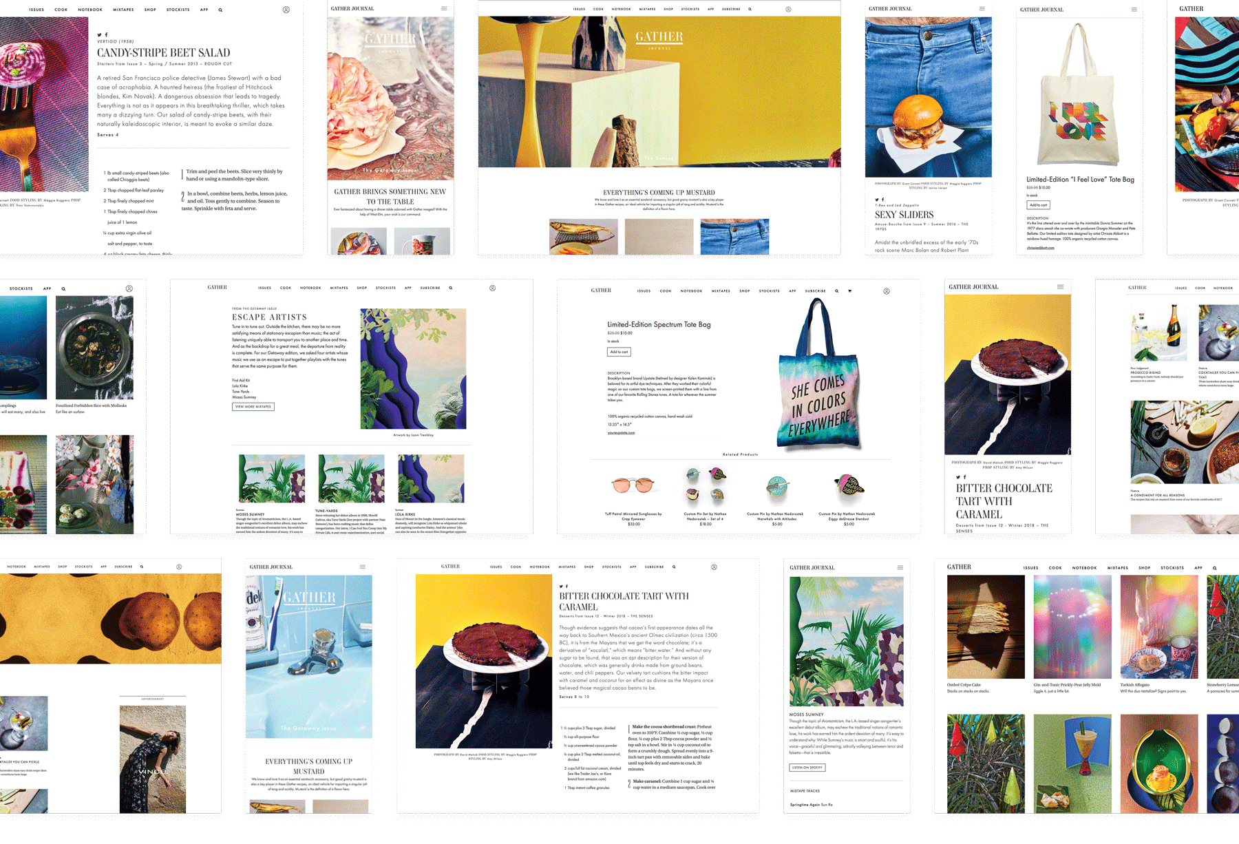
Website
ROLES: Digital Design Director, Data Architect, Lead Engineer
CATEGORIES: Design, Development, Strategy, Websites, Apps
THE BRIEF
After Gather Journal launched their first print issue in 2012, they approached my team to help them create a digital platform that would allow them to grow.
PROJECT GOALS
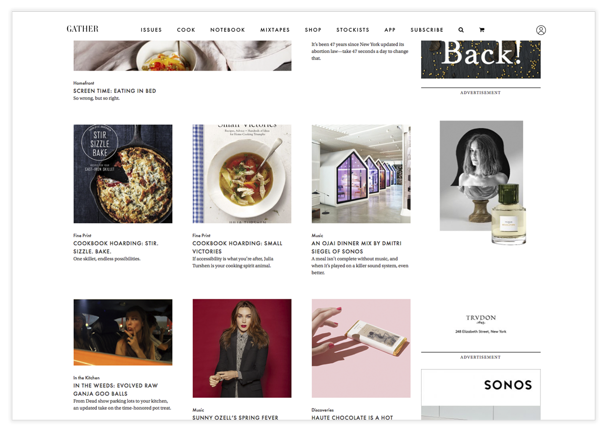
- Create a space for Gather Journal readers to discover all areas of each issue: essays, music, recipes, and curated products.
- Gather is known for its beautiful design and its digital expressions must keep this standard.
- The Gather team is small, so the website can not be a large burden on their team.
- Increase the subscriber base of the magazine.
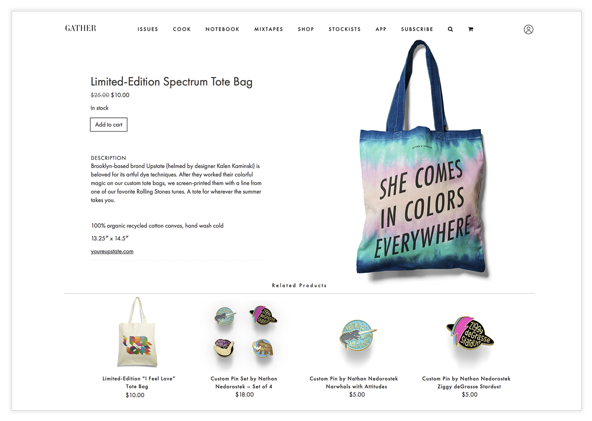
- Allow readers (new and old) to easily find and purchase Gather issues and curated products.
- Create new channels for advertising revenue.
THE DETAILS MATTER
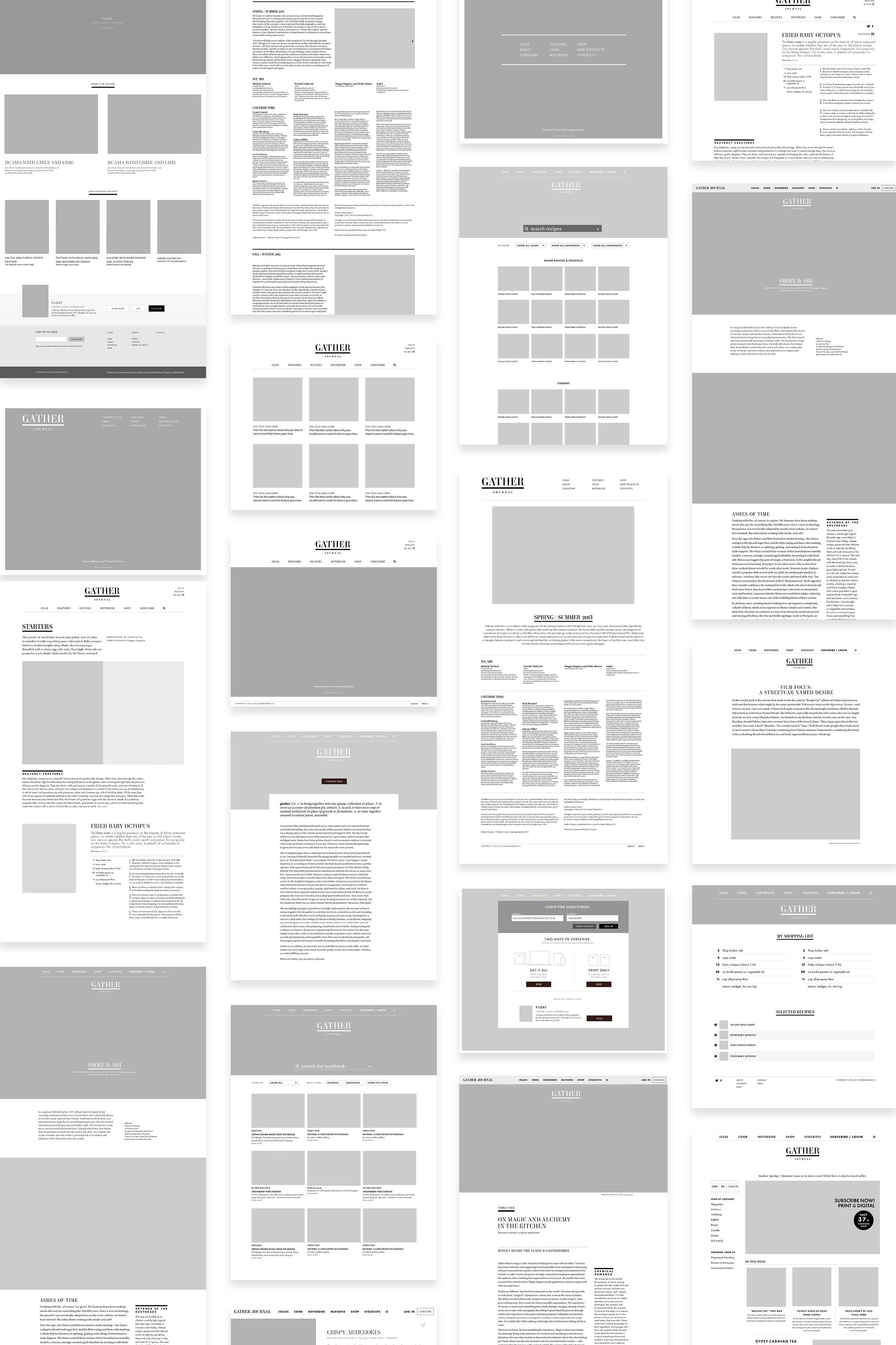
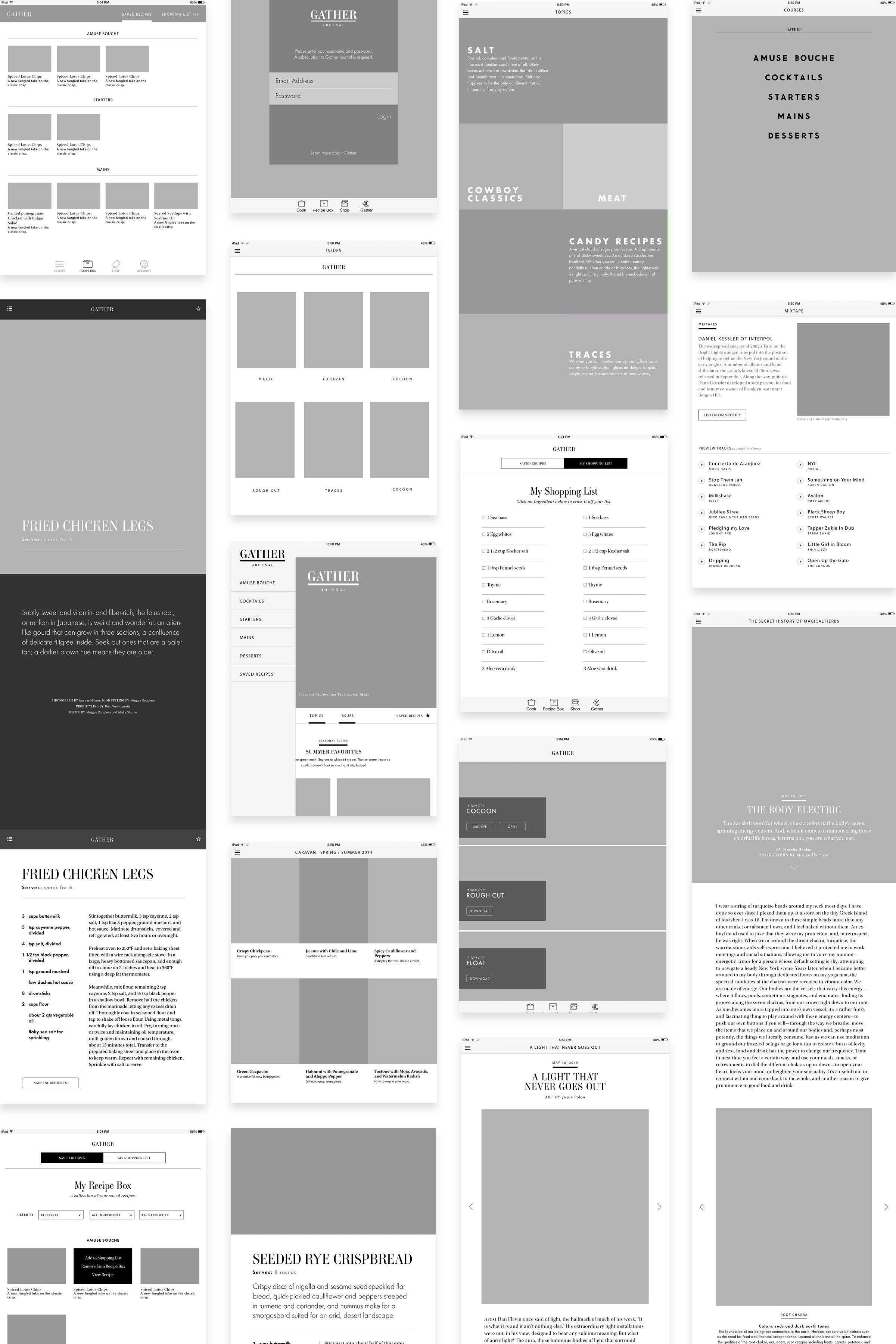
Every step of the way we wireframed all possible features and iterations. We thought through every aspect of how their unique design could be translated and what readers would want most of a Gather Journal website. We did extensive user testing on features, navigation, reading experiences, and cooking experiences. We took our devices into the kitchen with us and cooked with recipes to see how the experience of cooking with the website would feel.
BEAUTIFUL IN PRINT.
BEAUTIFUL IN DIGITAL.
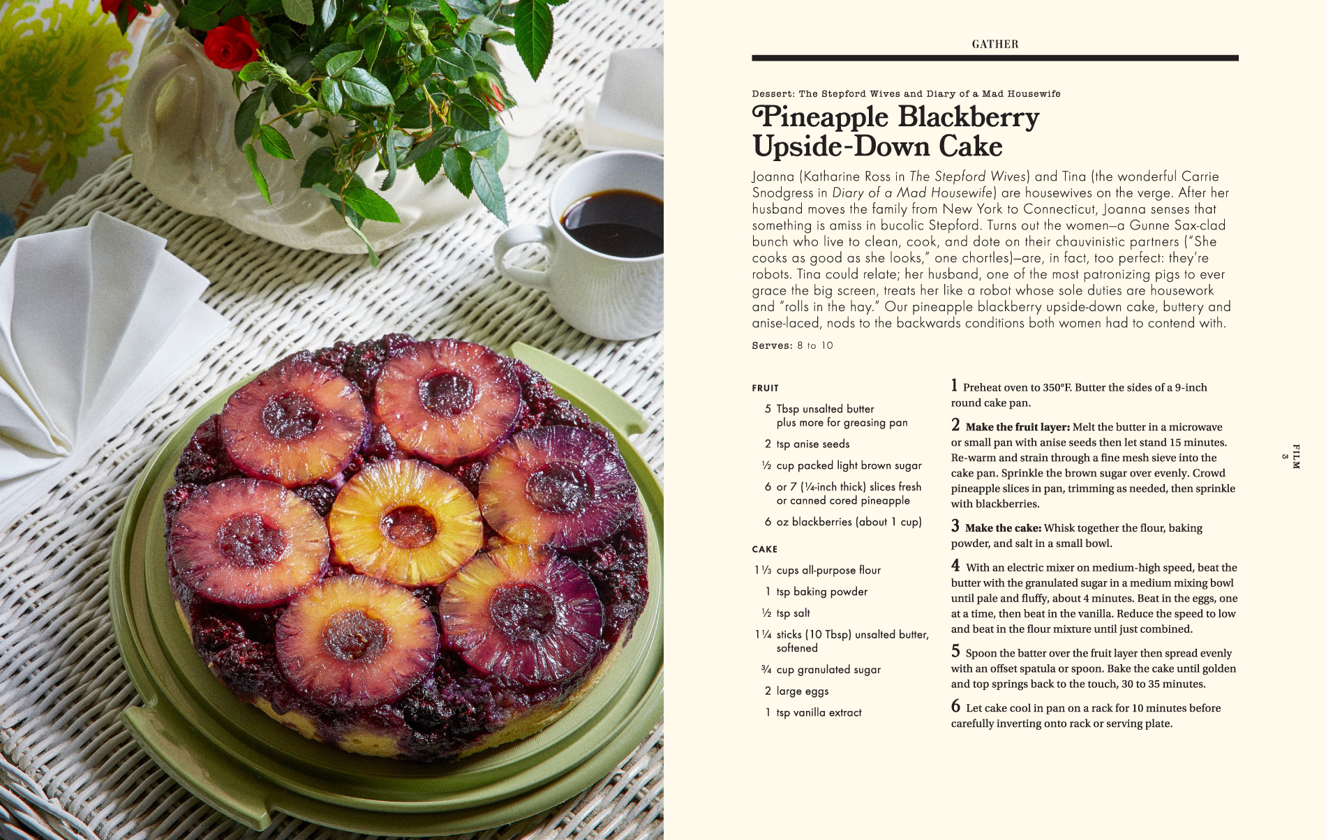
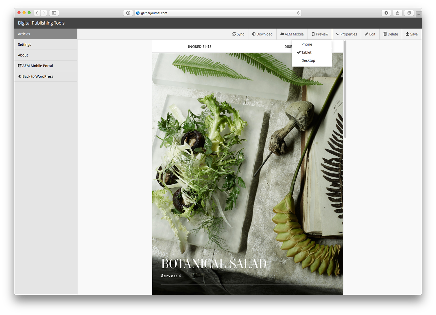
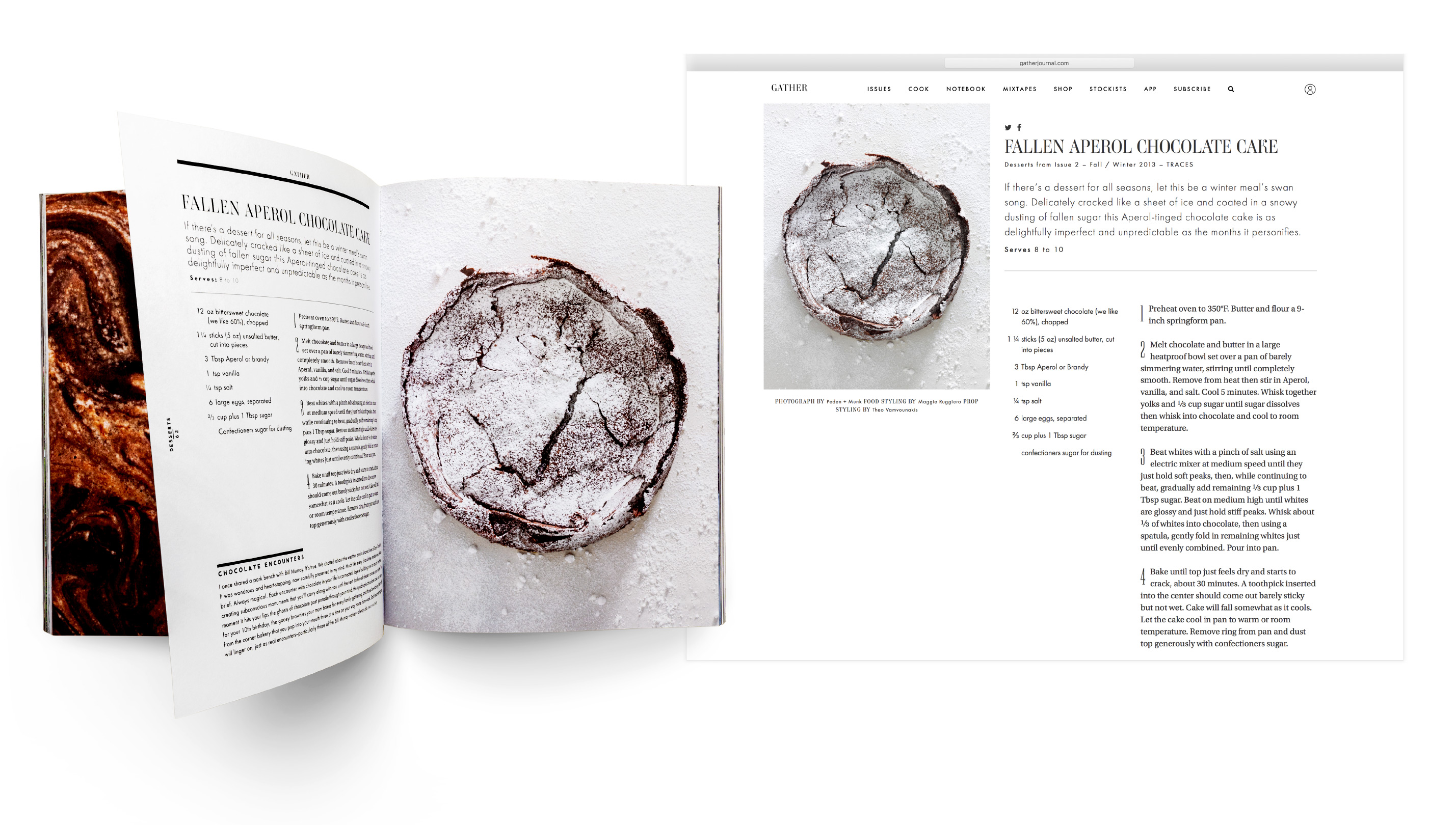
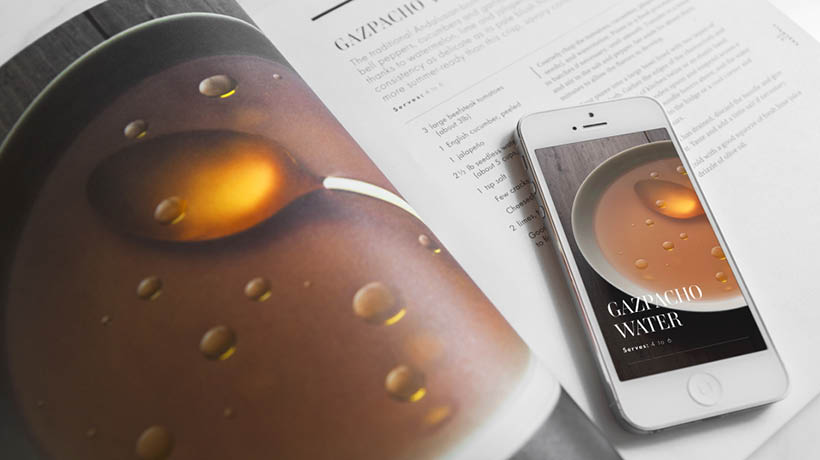
Gather Journal is known for its stunning food photography and beautiful typography. In translating the magazine into its digital counterparts, we knew it was important to maintain an attention to design. We carefully created a digital design that would continue the elegant experience from print to the screen.
A COHESIVE DIGITAL VOICE
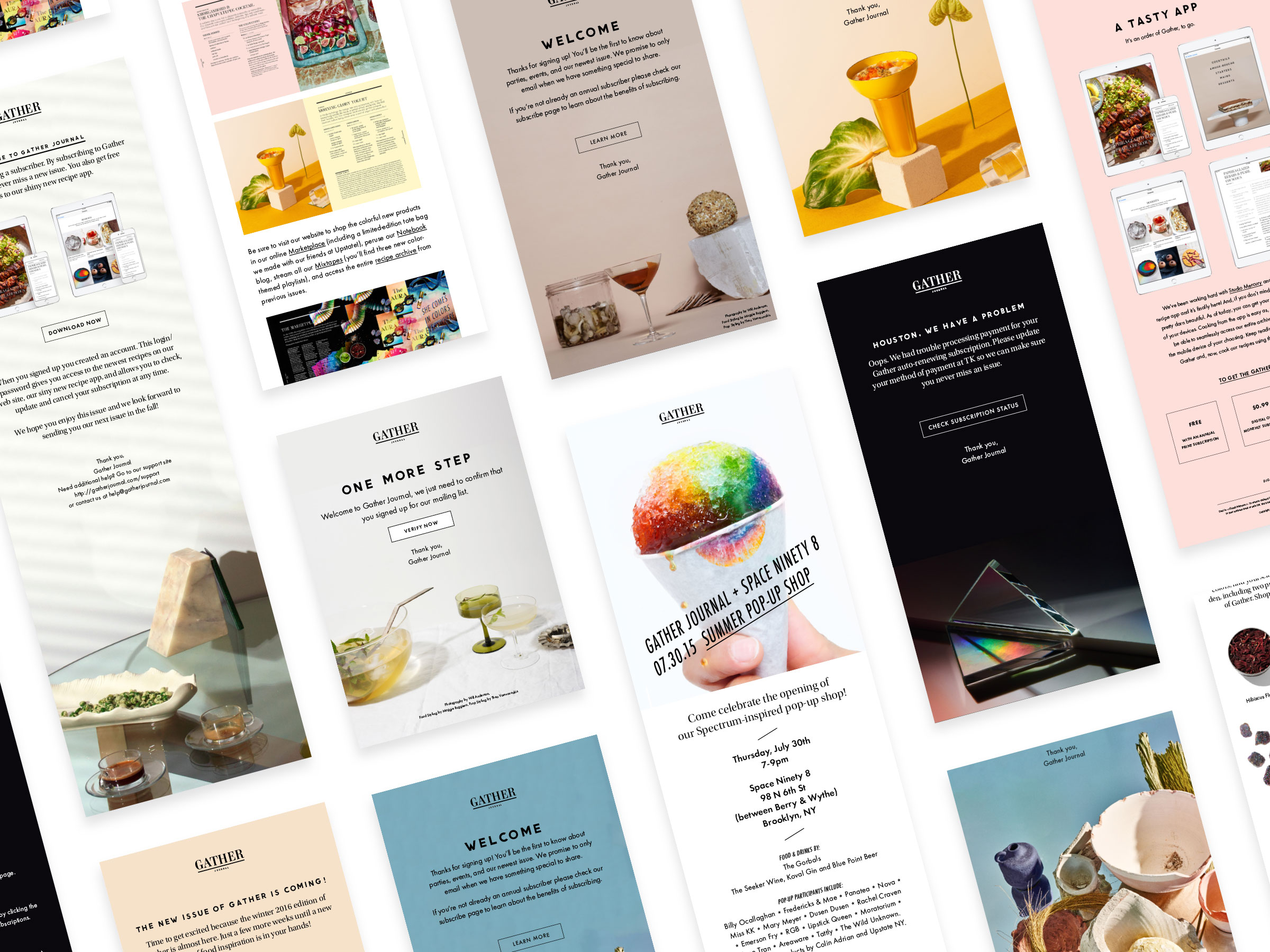
We sought out to create a cohesive digital voice for the reader. We collected and analyzed every aspect of a user’s digital interaction with the brand: newsletters, announcements, signup forms, forgot passwords, declined credit card emails, etc. We noticed all of the different systems used different templates and voices to talk to the reader. We re-designed and customized all of these systems so every time the reader heard from Gather Journal it was in the style and voice they were used to seeing from the magazine: fun, playful, and beautifully designed.
DATA THAT'S SMART
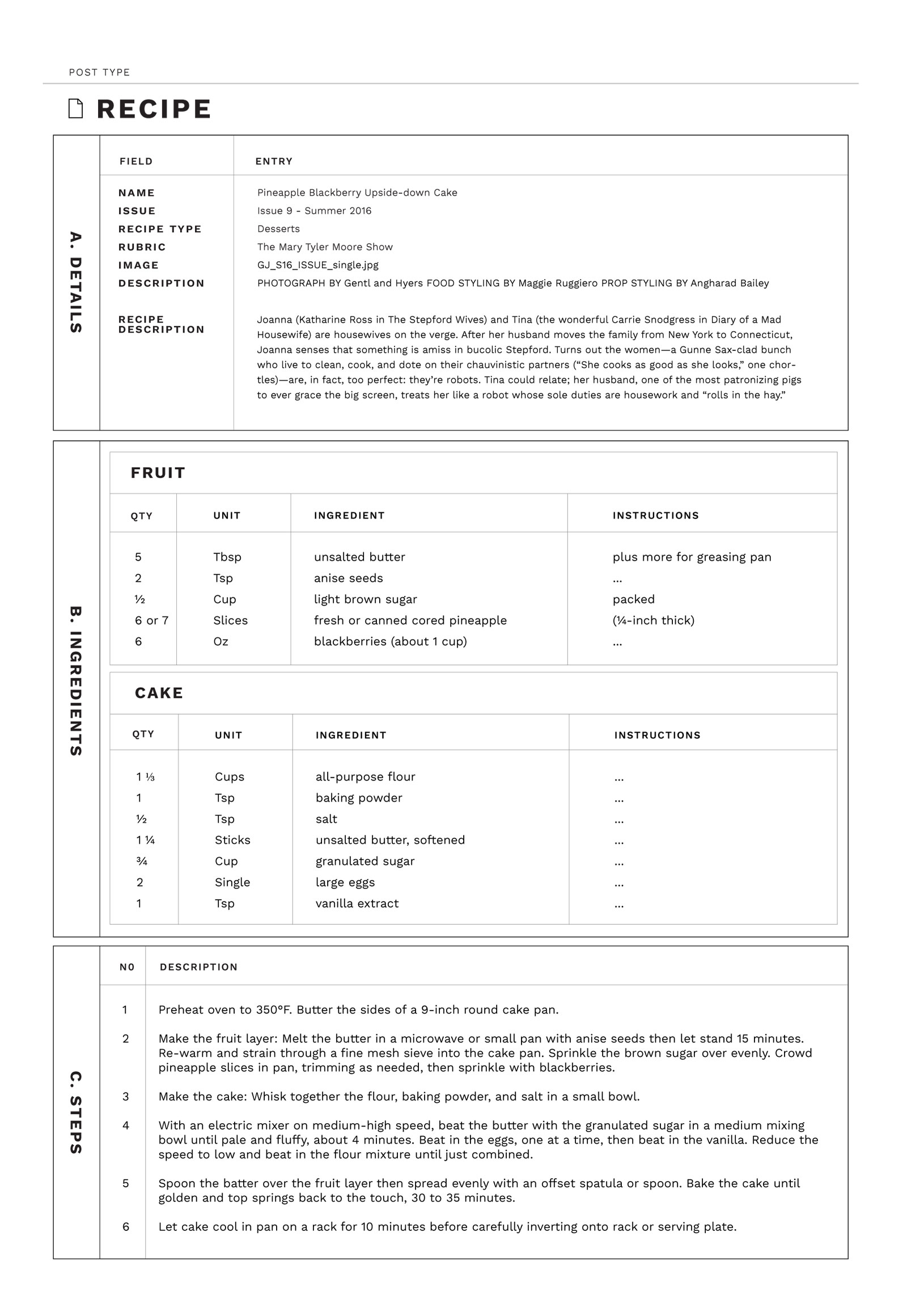
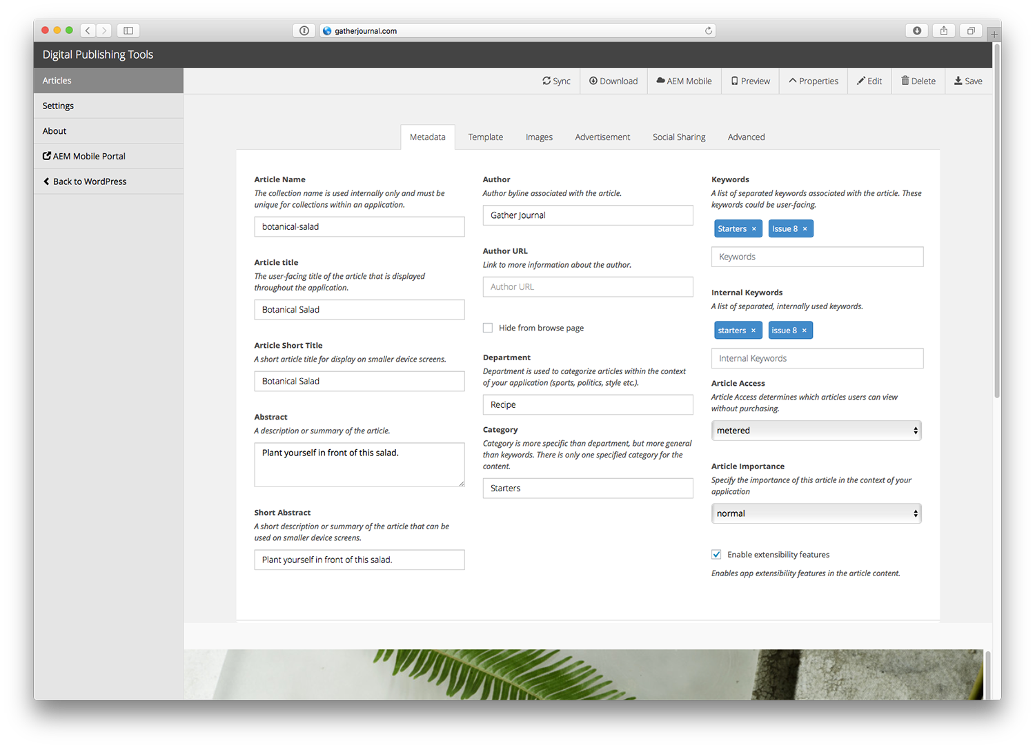
The Gather Journal team is small and needed an easy way to input all of their content: recipes, issue metadata, imagery, mixtapes, essays, products, etc. By leveraging an existing CMS that was easily extensible, we were able to get an MVP up and running in a short period of time. We carefully architected how the data would be leveraged and stored in the system so the Gather team could enter it once and easily re-use and re-purpose it for all of the future digital products. Because we architected the data to be broken up into smaller parts, we could easily bring the data back together in new ways.
One of the biggest ROIs was changing our template for recipes on the website. We were able to tag all recipe parts (ingredients, steps, servicing size, etc) using Google’s rich snippet markup. This small change translated into a dramatic increase in visitors because the recipes were easily searchable.
THE RESULTS
Gather’s first issue launched in 2012 and the following issues saw a steady growth. After the digital platform was launched (website and subscription platform) we saw a dramatic increase in sales. We saw a 400% increase in their their subscriber base. The Gather team also saw an increase in advertising sales with new opportunities and value ads for advertisers across the website. Also, people noticed and loved it. Gather Journal won countless SPD medals including: Gold Medal for Use of Photography on a website and was Brand of the Year in 2016.
Recipe App
ROLES: Product Director, Data Architect, Lead Engineer
CATEGORIES: Design, Development, Strategy, Websites, Apps
THE BRIEF
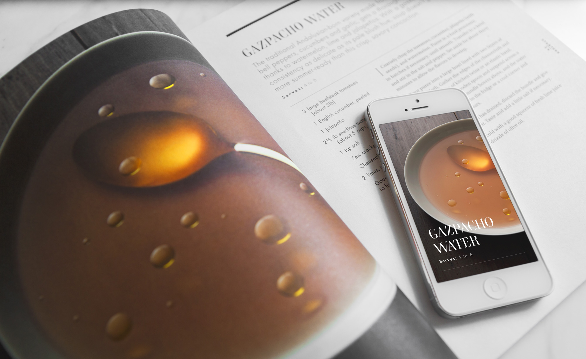
After the launch of the website, we wanted to see if there were other digital products that made sense for the Gather Journal reader. During insight research, we discovered subscribers were buying two copies of Gather Journal — one for the bookshelf and one for the kitchen. We decided to replace the need for the “kitchen copy” by creating a recipe app designed as a cooking companion.
PROJECT GOALS
- The app must be beautiful and keep the attention to detail of the print magazine & website.
- The app must work on tablet & mobile devices.
- Recipes are the most important feature so readers need to be able to search and find recipes easily.
- Introduce the Gather brand to new audience demographic.
- The Gather team is small so it must be easy to update without having to bring in engineers every time new content is pushed.
ITERATIONS
We interviewed readers and found out what they would want most out of a Gather Journal app: recipes, mixtapes, essays. They wanted the pages of the magazine to come to life in a way that would help them while they were in the kitchen or mixtapes they could play during their dinner parties. Most of all, they wanted it to be beautiful but functional.
We looked at the landscape of magazine apps on the market and discovered almost all of them were replicas of the print magazine on the tablet/mobile. We wanted to create something different: an app that focused on recipes and the experiences readers wanted without having to remember what recipe was in what issue.
We spent countless weeks working out the key features, navigation, and the architecture of the recipe app. In the end, it was clear, the app needed to focus on recipes. Recipes could be easily searched by text, searched by type (like appetizers, mains, or desserts), searched by the issue they came from, or readers could discover recipes grouped by theme by the Gather Journal editors.
A RECIPE APP YOU WANT TO USE
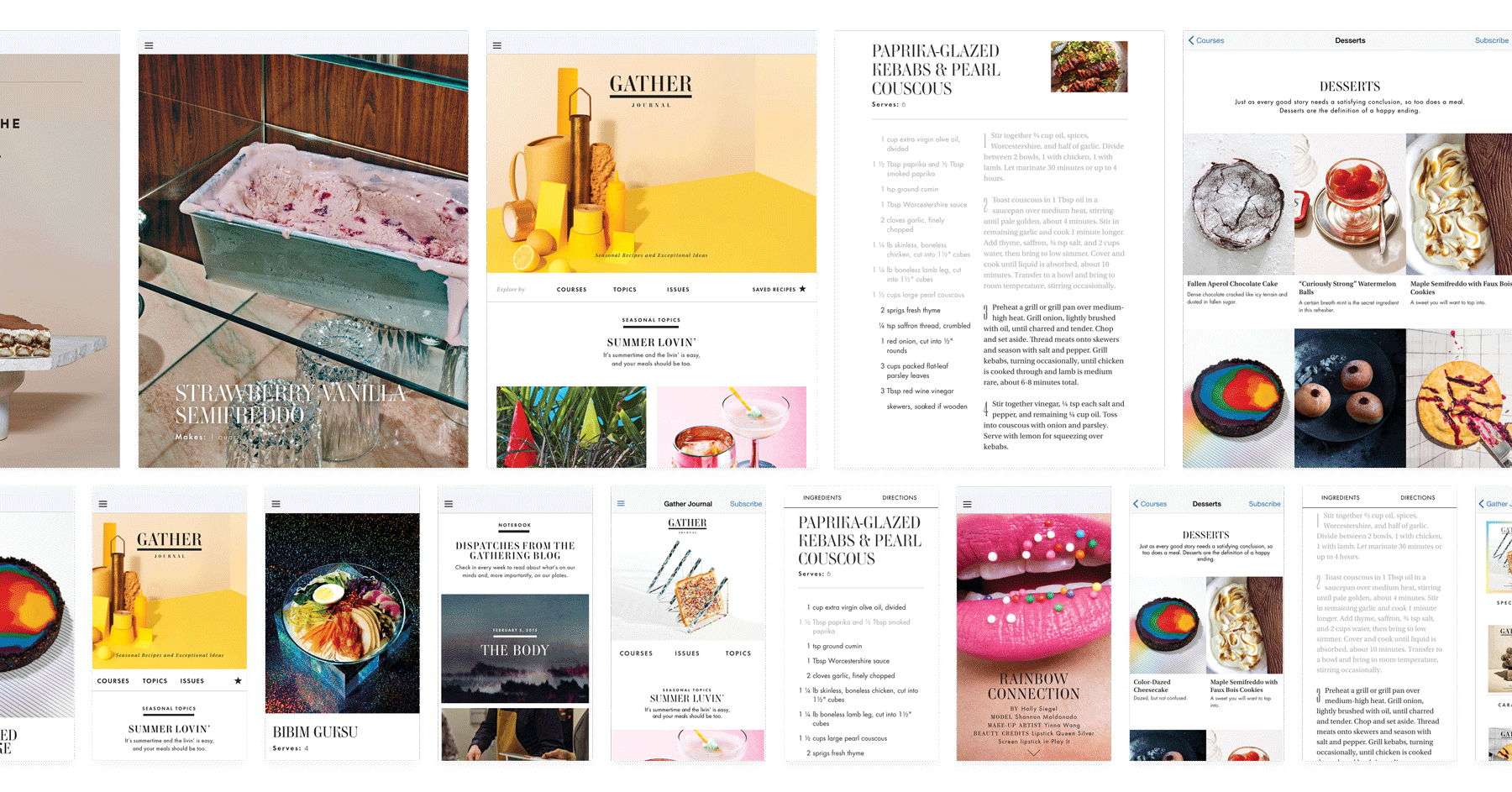
Recipes can be discovered using multiple entry points: by issue, by themes curated by the editors, by topics (like starters or desserts), or a generic text search (it even searches through the ingredients in the recipes). We included features that would help the reader keep track of where they were in the recipe while cooking: tapping on a step or ingredient greyed it out to visually keep track of the last step/ingredient.
WHEN THERE'S NO TOOL AVAILABLE – BUILD YOUR OWN
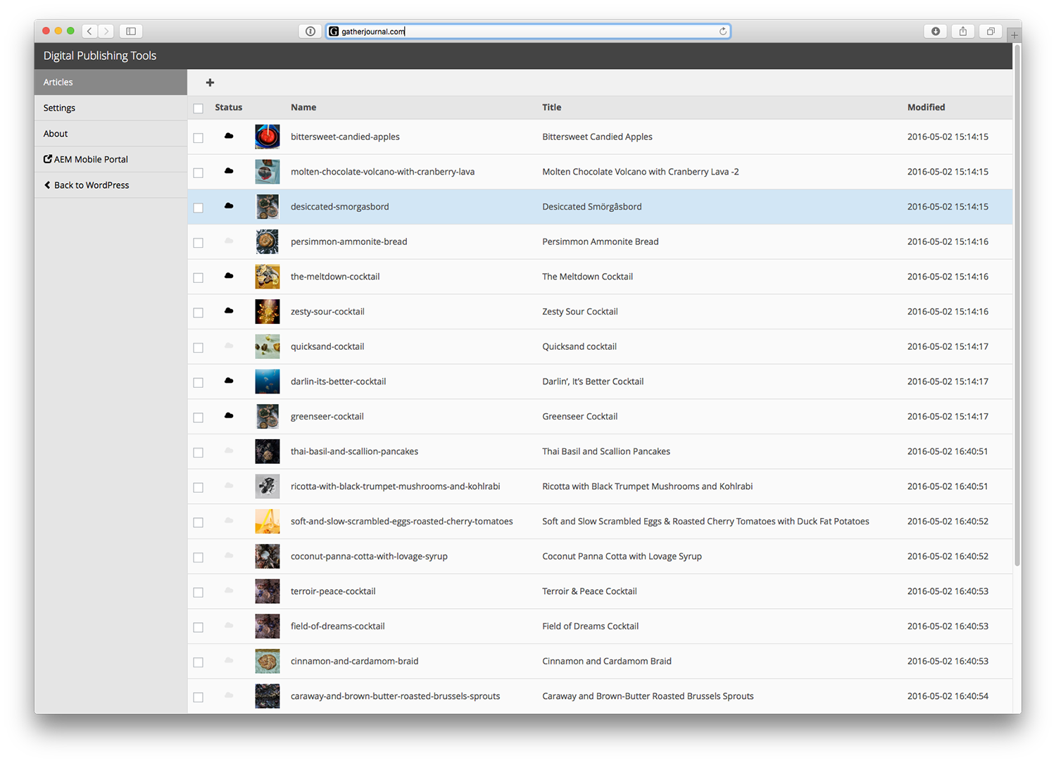
My grandfather was a tool and die makers and taught me that when there’s no tool around to make your own. At the time, there was no easy way to create digital app content from a CMS. We partnered with Adobe and created an open-source plugin that would allow the creation of digital app content directly from WordPress. I lead a small team of developers to create an easy-to-use tool that saved the team at Gather Journal countless hours in creating content for the app. The team could import their already existing recipes, mixtapes, and essays from WordPress into Adobe’s Experience Manager Mobile and push new beautiful HTML content into the app in a matter of hours.
IT WAS A BIG HIT
A few months after its release, the Gather Journal recipe app was selected as an Editor’s Choice on Apple’s App Store. This increased Gather’s visibility in a space they were just entering. The app also won silver and gold in the Society of Publication Design’s 2016 SPD awards. Adobe also invited Gather Journal and our team to talk about how it was created during their keynote launch of Adobe Experience Manager Mobile.
PROVEN GROWTH
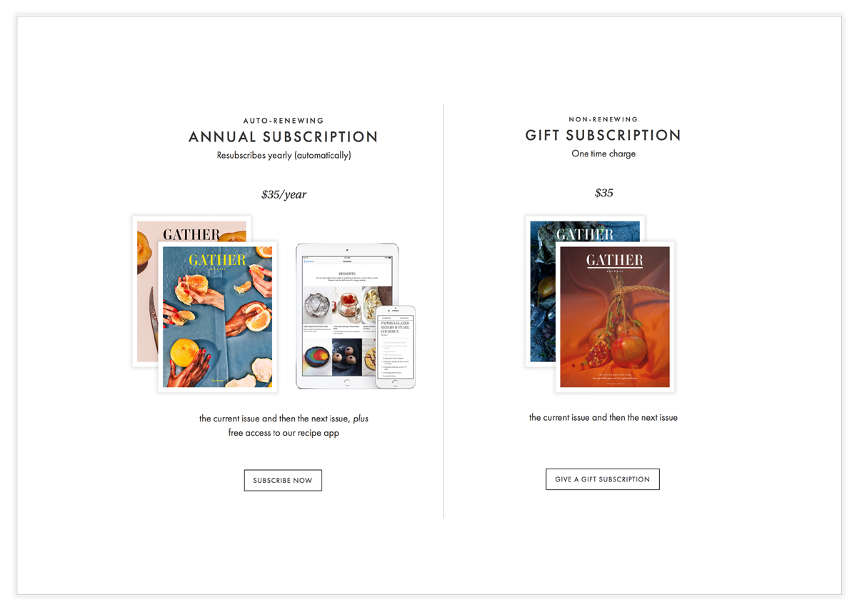
We launched the app and it was offered as a free product for all readers with an annual auto-renewing subscription. This produced a 68% increase in subscriptions. After its launch, the Gather Journal Recipe App was installed on over 11,000 devices. Our analytics showed the app was reaching demographics the website wasn't.
Case Studies
West ElmProject type
Gather JournalProject type
Martha StewartProject type

MyGQProject type

Garden & GunProject type
Sotheby'sProject type

NARS CosmeticsProject type

Selected WorkProject type
ABOUT ME
I’m Nate Mueller – designer, builder, and former partner at Studio Mercury.
At Studio Mercury, I produced comprehensive award winning brand identities, campaigns, and digital products that spanned multiple industries and platforms. As co-founder and director of digital at Studio Mercury, I oversaw the creation of digital identities, translation of brands throughout their digital projects, and manages all aspects of projects from start to finish between multiple stakeholders, designers, and development teams. I wrote, pitched, and presented proposals that allowed our studio to compete and win projects with $500k budges. I led both creative and development teams of between 5-15 people, all while working on multiple projects (usually between 8-12 concurrently). I’m a passionate leader with success in building, mobilizing, and developing cross-functional teams of strategists, designers, programmers, directors and photographers.
While pursuing my Masters at the Rhode Island School of Design (RISD), I developed a healthy skepticism of the role of technology in our lives. I believe the integration of technology should be purposeful and well thought out and I apply this ethos to my work.
Sometimes when I’m tired of looking at the screen, I’ll hand-print wallpaper or hack Nintendo cartridges. Working with my hands helps fuel my inner maker.
I currently live in San Francisco.

You can reach me at: [email protected]
LinkedIn or Instagram.
You can reach me at: [email protected] LinkedIn or Instagram.
You can reach me at: [email protected]
LinkedIn or Instagram.
